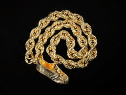
Jewellery from the 80s
Logotypes and Heritage quotes
By Emilie Bérard and Marion Mouchard
In the context of the economic recession at the beginning of the decade, the working class demonstrated its consumer power through jewellery that was branded, sometimes excessively, with recognisable models that could easily be attributed to a luxury brand.
While the aim of this clientele was to assert their socio-economic group by conforming to appearances, the aim of the jewellers was, on the contrary, to stand out from the crowd. Cartier, for example, used the slogan "The art of being unique" in its advertising.
A- Logo jewellery
For the first time, the logotype[1] or logo of luxury brands, previously reserved for advertising, has become an ornament in its own right on both jewellery and clothing, as seen at Moschino, Chanel and Versace, for example.
This search for identity is fuelled by the explosion of counterfeiting[2] , which the managers of the major jewellery houses are trying to combat. Most of them simply track them down, buy them back and destroy them. Alain Dominique Perrin, chairman of Cartier, wanted to take advantage of this unfavourable situation. At the time, the Tank watch was one of the most copied pieces of jewellery. He undertook to organise major campaigns to collect counterfeit watches and then to destroy them with a steamroller, a staged event that was broadcast in France on the 1pm news[3]. Alain Dominique Perrin went so far as to entrust the sculptor César with a few examples of counterfeit watches to design a compression, which he installed ostentatiously on his desk in the Cartier boutique on the rue de la Paix. The Maison's success was twofold: it deflected the negative impact of counterfeiting by demonstrating that the number of fakes only reflected the success of its creations, and it created even more demand by transforming repressive campaigns into genuine publicity stunts.
In short, the phenomenon of logo jewellery began in the early 1970s in the production of jewellery houses going through an economic and identity crisis. However, it came into its own in the following decade.
Bulgari
In 1975, Bulgari developed a limited edition of digital watches with the inscription "BVLGARI ROMA" for the brand's 100 best customers during the Christmas period. On the basis of this promotional jewel, Bulgari created the BVLGARI BVLGARI watch. Created in 1977, this model is characterised by the presence of the Maison's logo, engraved on the bezel as the only decoration.
Invented in 1934, the logo is a Latin typography in Roman capitals. Its layout, which follows the perimeter of the watch, is reminiscent of numismatic inscriptions. Like the Monete collection of 1966, the BVLGARI BVLGARI watch helps to anchor the jeweller's identity in the heritage of antiquity.
The example shown here features a bichrome Tubogas necklace in yellow and white gold, characteristic of the material orientation of jewellery in the late 1970s and early 1980s.
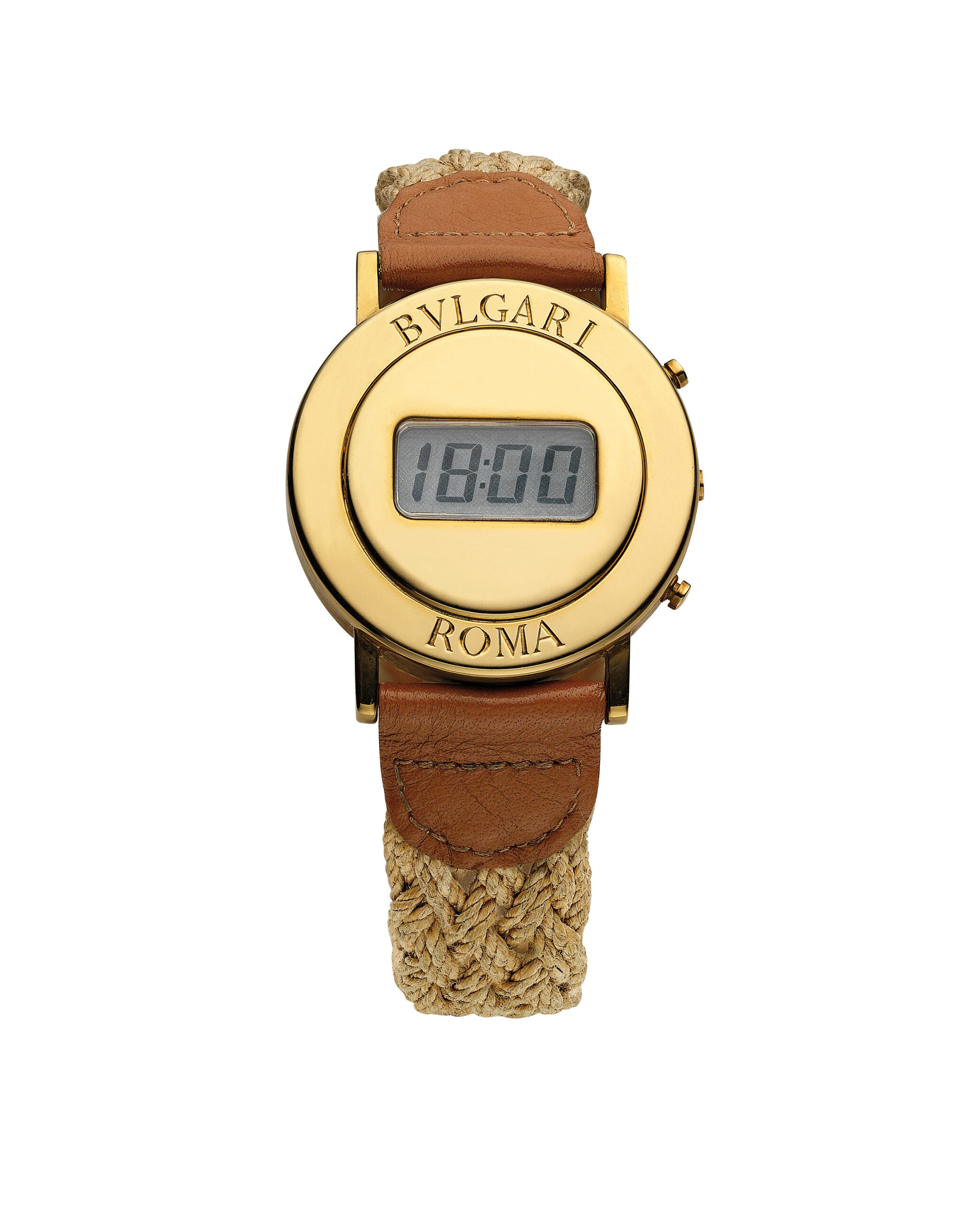
Bulgari, BVLGARI Roma watch, circa 1975, gold, natural hemp and leather, Rome, Bulgari Heritage Collection.
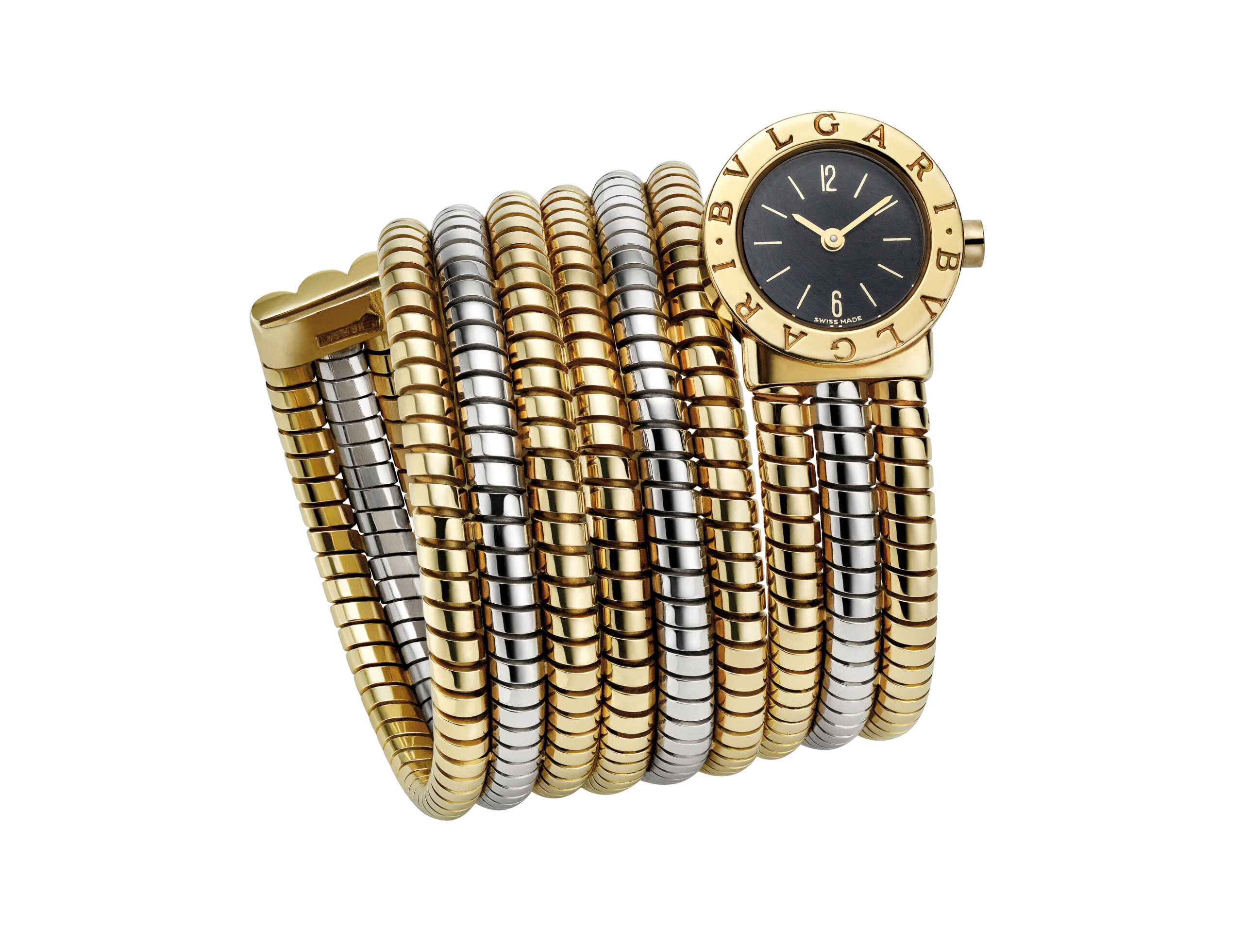
Bulgari, BVLGARI BVLGARI wristwatch, circa 1980, yellow and white gold, Rome, Bulgari Heritage Collection.
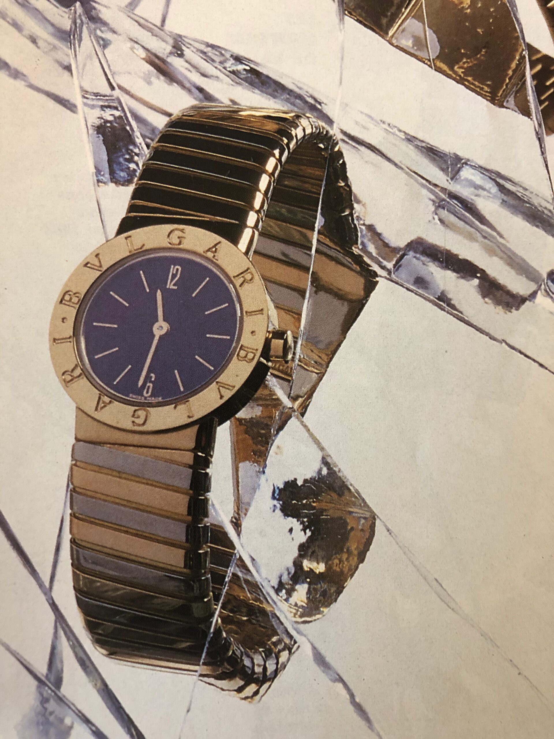
Photo of the BVLGARI BVLGARI wristwatch published in Vogue Paris, October 1987.
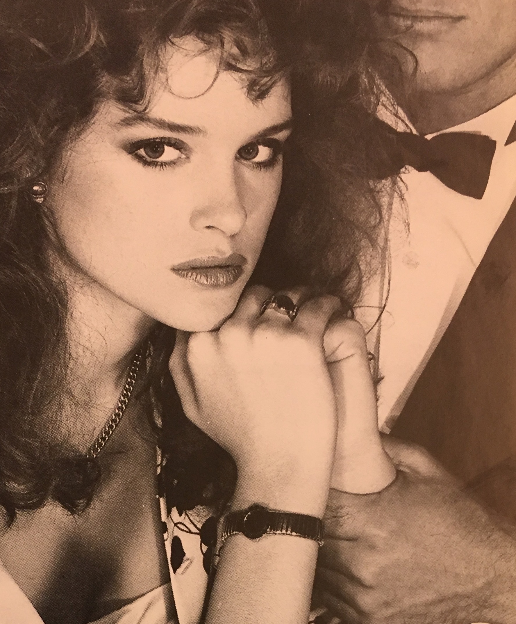
Model wearing the BVLGARI BVLGARI wristwatch, Vogue Paris, February 1982.
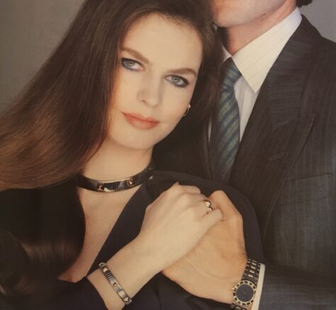
Lambert Wilson wearing the BVLGARI BVLGARI wristwatch and Cyrielle Claire wearing a Bulgari steel and yellow gold set, Vogue Paris, June-July 1983.
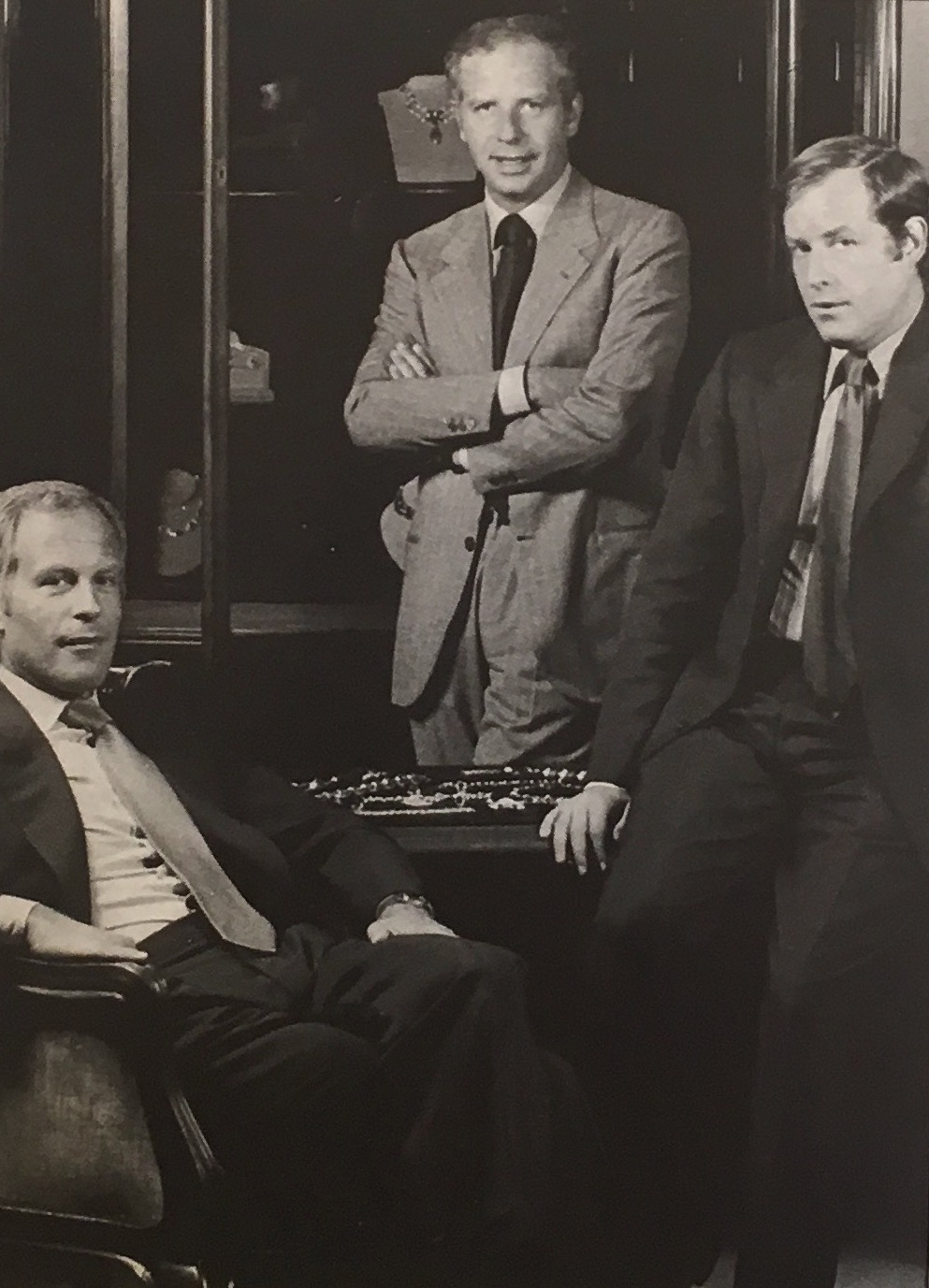
Photo of Gianni, Paolo and Nicola Bulgari published in Vogue Paris, November 1981.
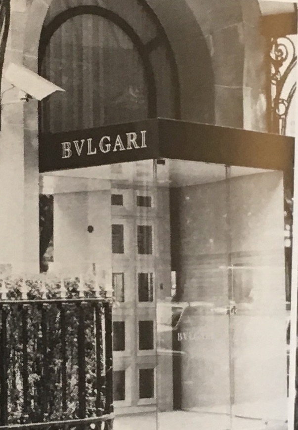
Photograph of the Bulgari boutique at 27, Avenue Montaigne, Paris, published in Vogue Paris, November 1980.
Van Cleef & Arpels
Since 1933, Van Cleef & Arpels has filed numerous trademark applications for monograms [4], but since the 1970s, the Maison has made full use of its logotype in its creations as a means of visual recognition. Until the early 1990s, the house branded accessories such as bag clasps and belt buckles with the VCA logo, as well as its watch lines.
An emblematic model is the Sport Collection 22 watch, registered in 1983. It has an articulated steel bracelet and a yellow gold dial surmounted by the VCA monogram. The three superimposed letters, characterised by their geometric design, are a repetition of a number used on a Minaudière as early as 1936. This watch thus diversifies the watchmaking creation by returning to the visual identity of Van Cleef & Arpels in the 1930s.
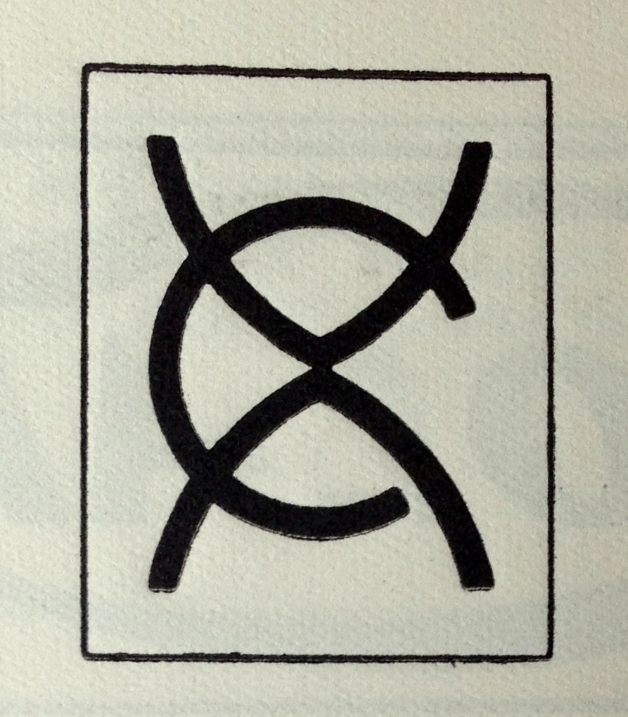
Trademark registration of a monogram for watches, jewellery, goldsmiths' and silversmiths' articles, leather goods and smokers' articles, 31 January 1933, Van Cleef & Arpels Archives.

Trademark registration of a monogram for watches, jewellery, goldsmiths' and silversmiths' wares, leather goods and smokers' articles, 10 December 1962, Van Cleef & Arpels Archives.
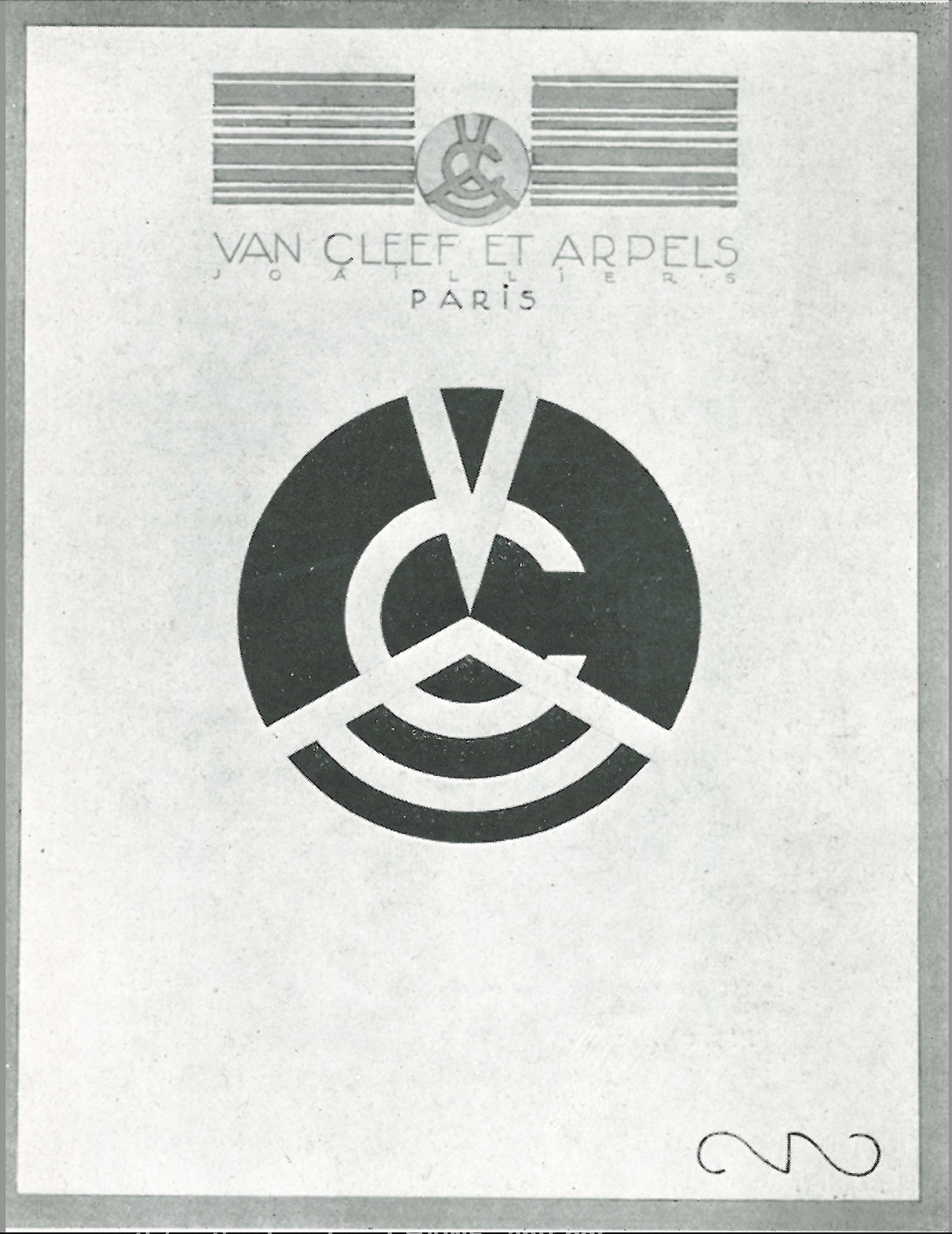
Robert Couallier, advertising image for Van Cleef & Arpels, La Renaissance de l'art français et des industries de luxe, 1928.
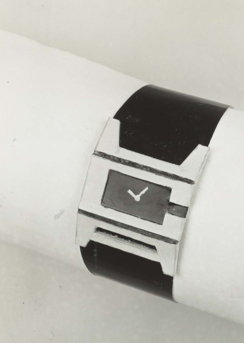
Deposit of a watch model, 1973, Van Cleef & Arpels Archives.
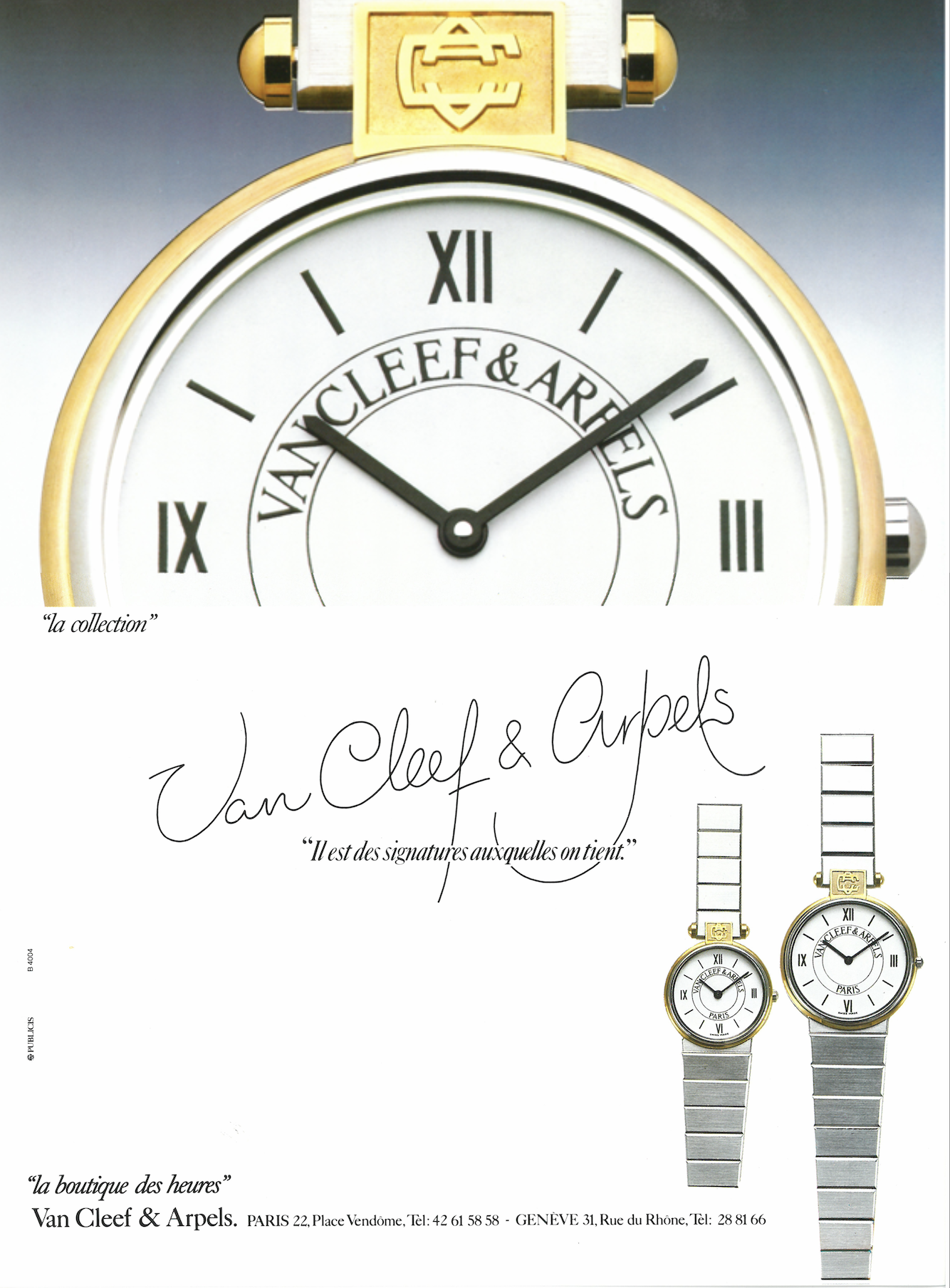
Van Cleef & Arpels advertisement, 1987, Van Cleef & Arpels Archives.
Cartier
Finally, in the 1980s, Cartier distinguished itself by creating jewellery with a logo.
Although the two intertwined or facing Cs - a motif derived from the neo-18th-century monogram that adorned Cartier jewellery cases - had already been used by the Maison before that date, this figure was one of the components of the revival that the brand underwent from 1973 onwards, driven by the launch of the Must range. A decade later, it adorned jewellery, watches, accessories and leather goods.

Ring, Cartier, 1985. Yellow gold, pink gold, white gold. This ring is often referred to as the Ressort. Nils Herrmann, Cartier Collection © Cartier
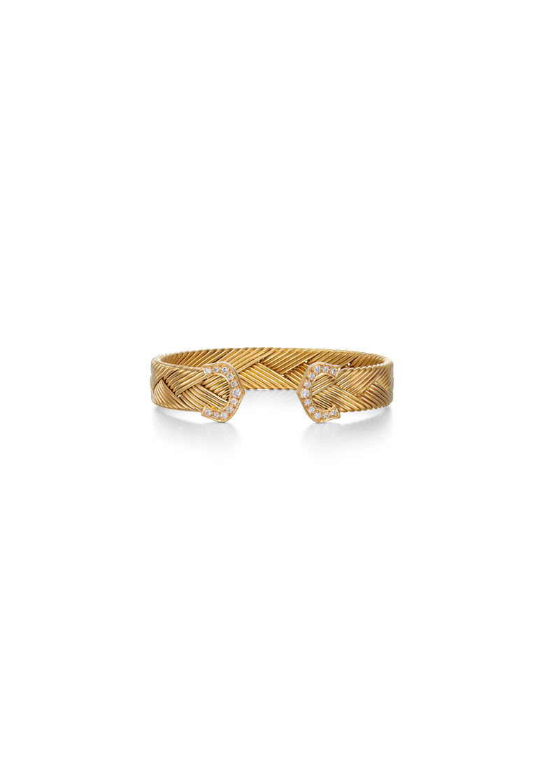
Bracelet, Cartier, 1990. Braided gold, diamonds. Often referred to as the Neptune, this bracelet was launched in 1988. Nils Herrmann, Cartier Collection © Cartier
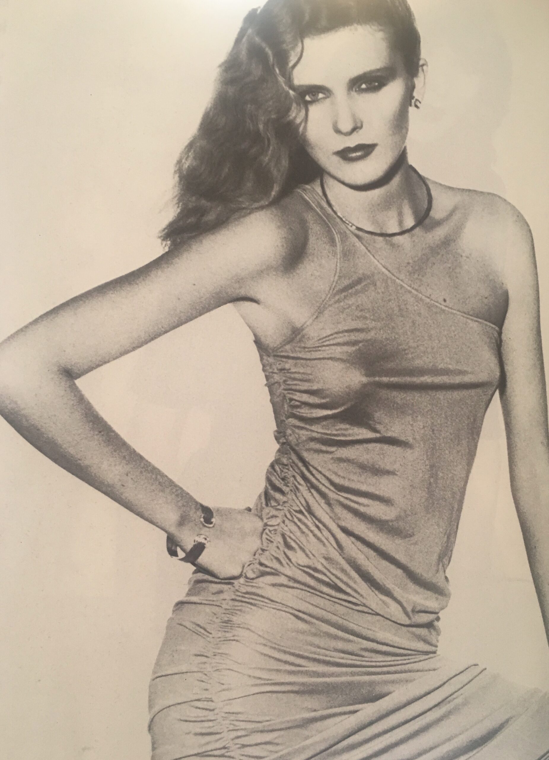
Model wearing a Les Must bracelet with two Cs at the ends, Vogue Paris, February 1979.
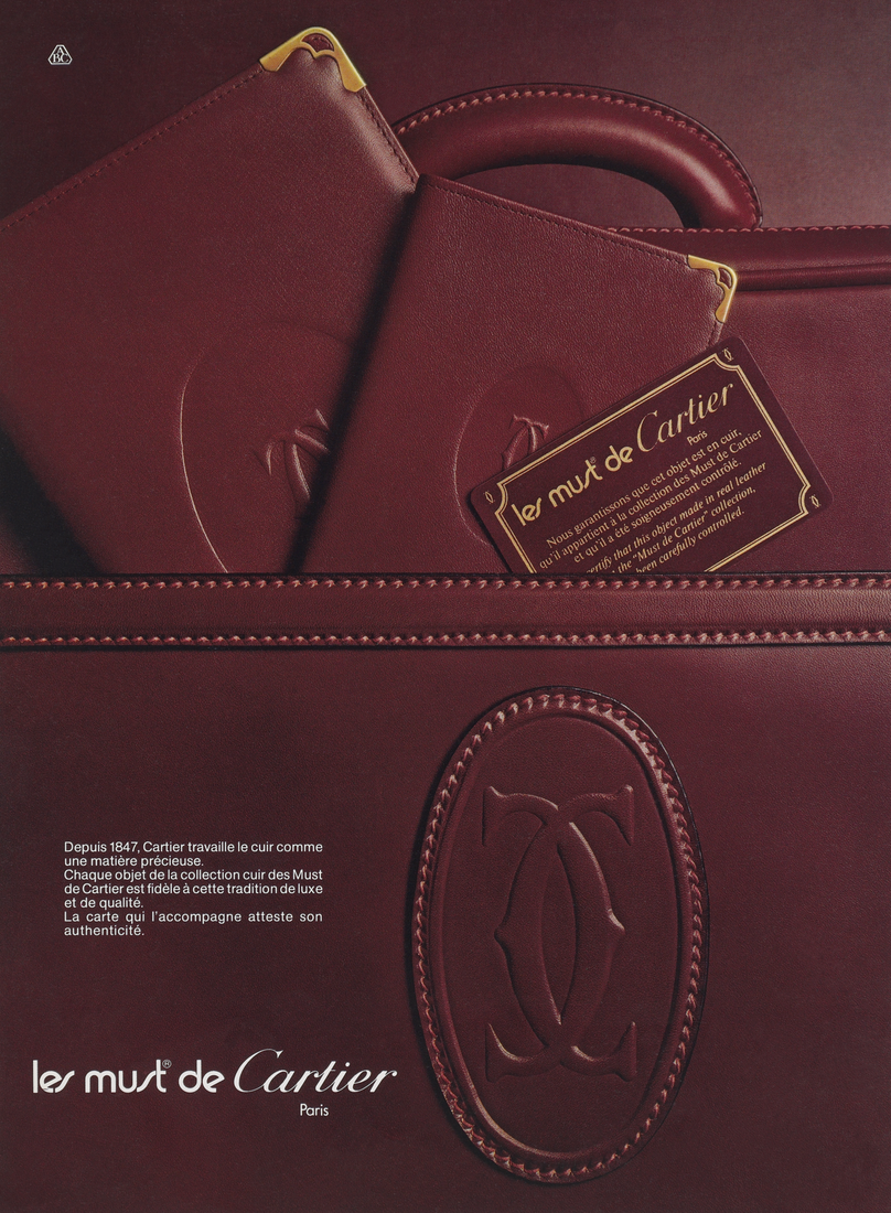
Advertisement for Les Must de Cartier leather goods, 1983. Les Ateliers ABC © Cartier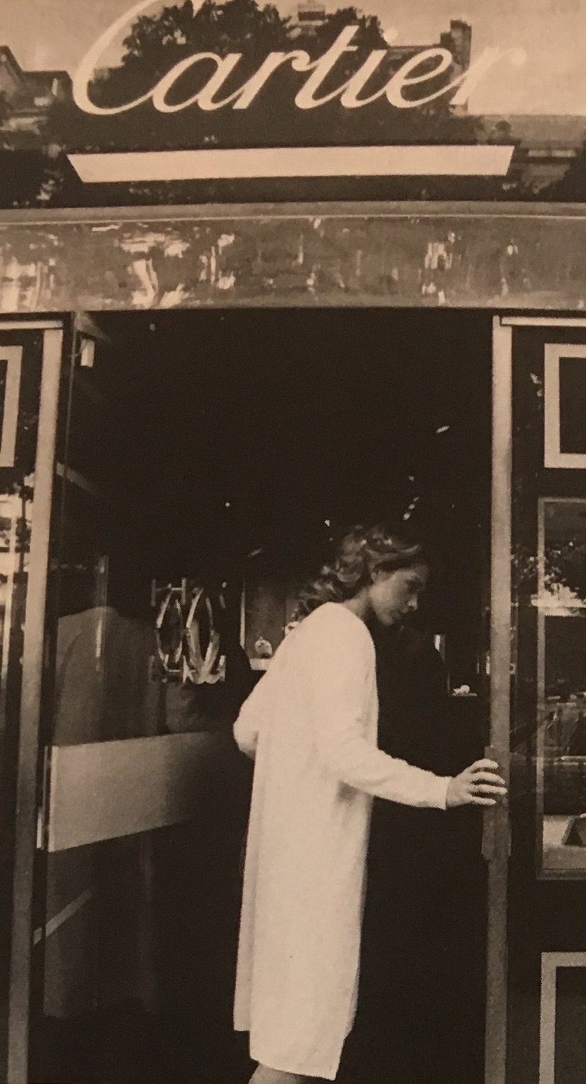
Photo of the Cartier boutique at 12 avenue Montaigne in Paris, published in Vogue Paris, November 1980. The door bears the Cartier monogram.
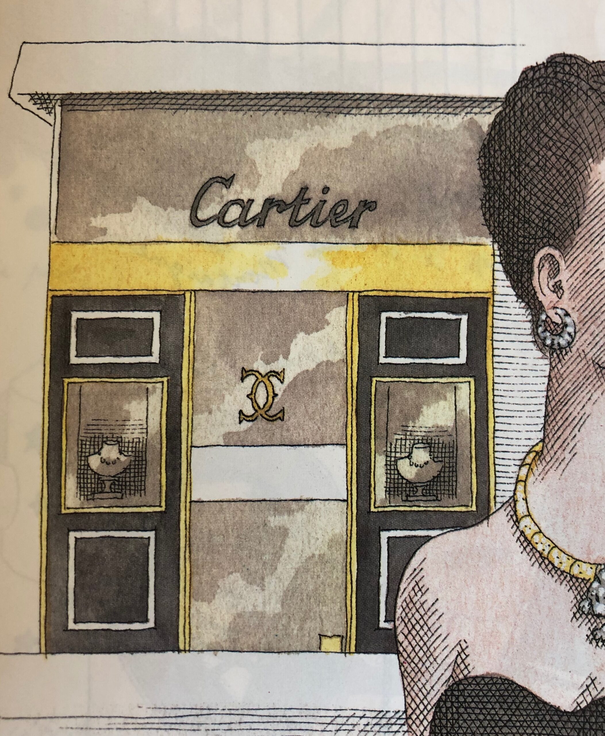
Pierre Le-Tan, drawing of the Cartier Boutique at 12 Avenue Montaigne, Paris, published in Vogue Paris, October 1987.
B- Heritage quote: jewellers returning to their roots
In addition to jewellery adorned with logos, the identity of jewellery houses is also expressed through references to past creations, which have become the embodiment of the brand with which they are associated.
The reissue of icons should be seen in the context of the enrichment of the heritage collections of these jewellery houses: from the early 1970s, Jacques Arpels pursued a policy of of buying back jewellery in order to build up the Van Cleef & Arpels collection. The same was true of Cartier, under the decisive impetus of Éric Nussbaum. This form of patrimonialisation echoes the assertion of identity by players in the luxury industry in the 1980s, who find legitimacy and prestige in their past. These values are sought after by customers who buy jewellery bearing their brand name.
The 1980s saw the apogee of a "new cultural economy" [5]: not only did culture become a major economic sector and thus the focus of investment strategies, but it also helped to stimulate other sectors of the economy. It was also the beginning of corporate sponsorship of culture: Alain Dominique Perrin created the Cartier Foundation for Contemporary Art in 1984. Heritage exhibitions and monographs on the history of the great jewellery houses proliferated during the decade: Sylvie Raulet wrote about Van Cleef & Arpels in 1986[6], while L'Art de Cartier was exhibited at the Petit Palais in 1989. Advertisements and press articles abounded, linking the construction of this new heritage to the commercial strategy of jewellery houses, such as Chaumet, which was celebrating '200 years of history' [7].
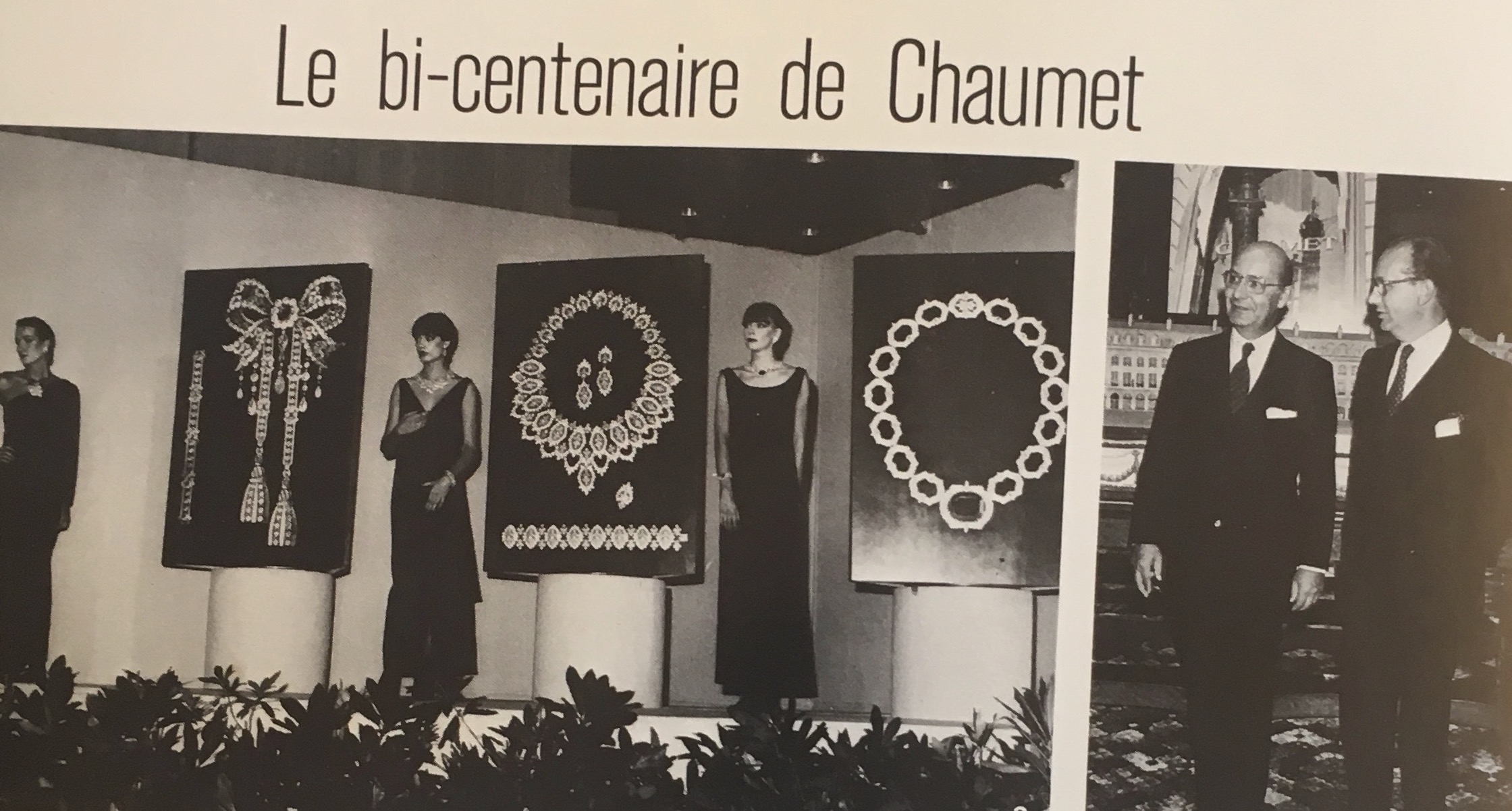
Grand cocktail party at the Pavillon Gabriel to celebrate Chaumet's bicentenary. On the right, Jacques and Pierre Chaumet. Vogue Paris, November 1980.
The panther motif, a Cartier icon since the early 20th century, continued to feature in the House's stylistic repertoire throughout the 1980s. The black-and-white spotted coat and the fawn silhouette would offer numerous variations on earrings, clips, necklaces, bracelets, rings and watches. In 1988, the brand launched the Egypt collection, which included a cuff in yellow and white gold. Based on the shape of the Egyptian pectoral, this creation is composed of two friezes of panthers in a walking position, superimposed on each other, a reinterpretation of ancient bas-reliefs. The brand has thus renewed its emblem and created a new icon.
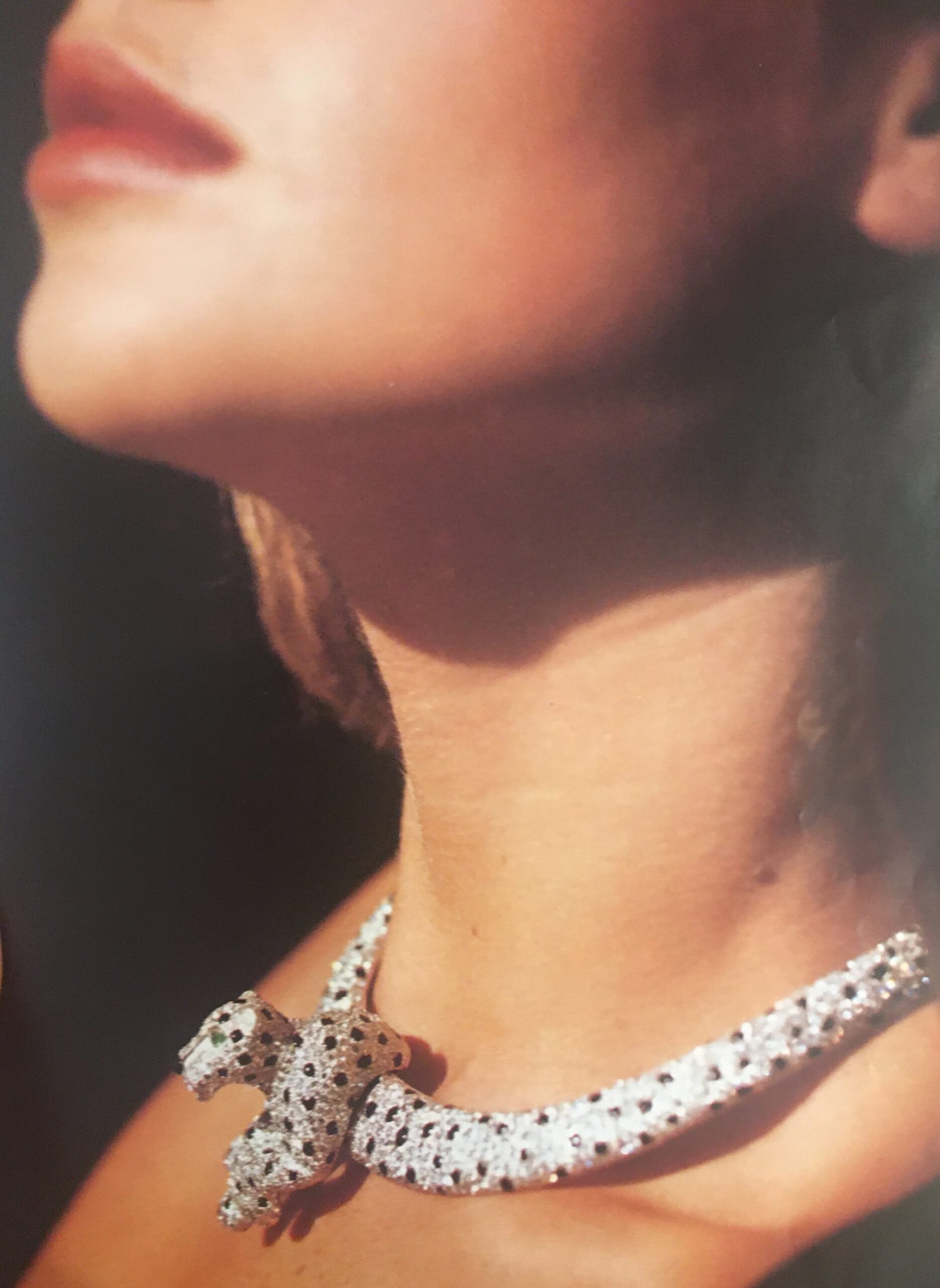
Necklace with removable panther brooch set with 1,600 brilliant-cut diamonds and onyx, mounted on white gold and platinum. Cartier. Vogue Paris, September 1986.

Rigid necklace with panther brooch, Cartier Paris, 1988. Platinum, white gold, diamonds, sapphires, emeralds, onyx. Marian Gérard, Cartier Collection © Cartier
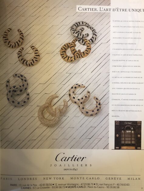
Advertisement for tiger and panther earrings by Cartier Haute Joaillerie, 1988. Les Ateliers ABC © Cartier
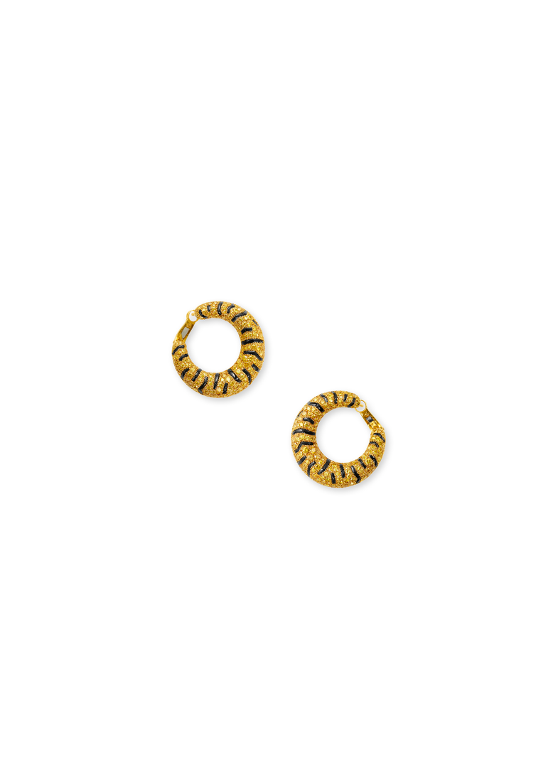
Tiger set, Cartier Paris, 1986-1987. Yellow gold, white and fancy intense yellow diamonds, emeralds, onyx. Nils Herrmann, Cartier Collection © Cartier

Hunter Reno photographed by Albert Watson, wearing Cartier Panthère hoop earrings, cover of Vogue Paris, April 1984.
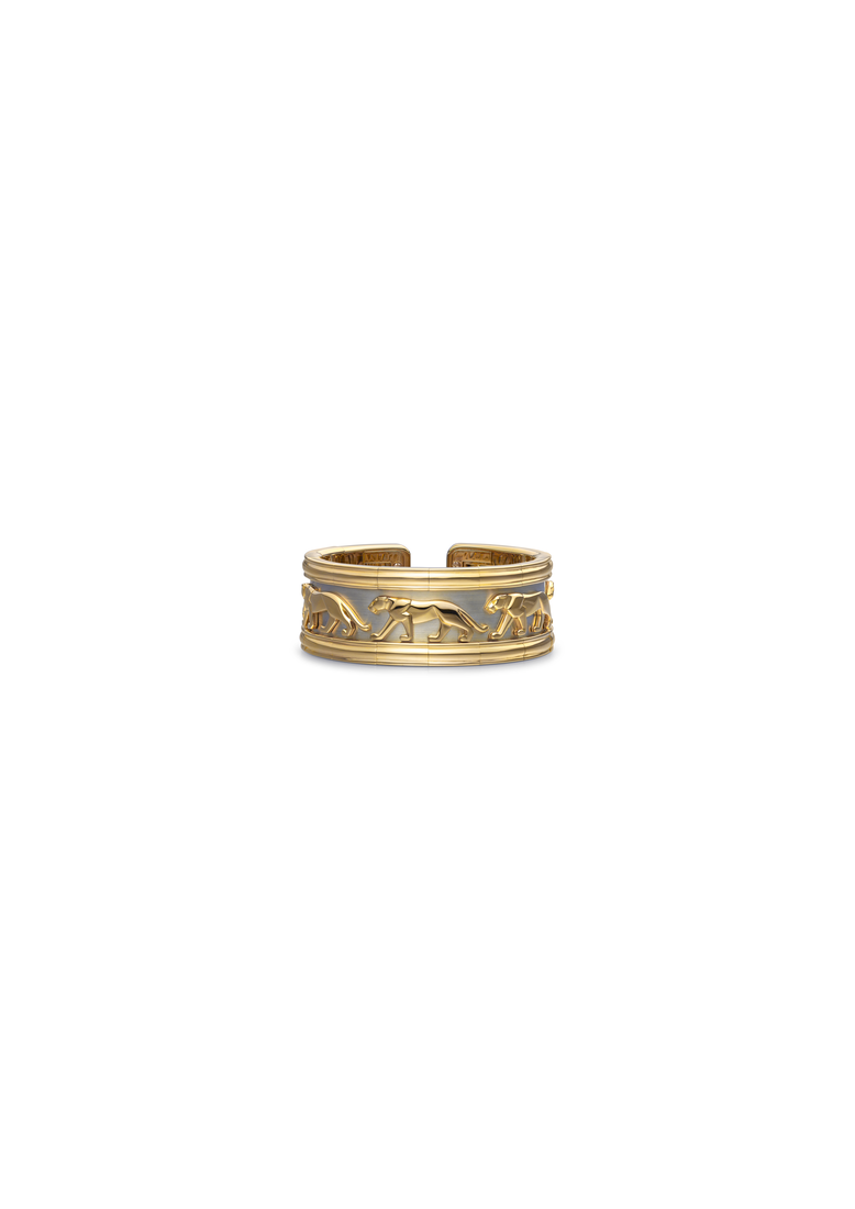
Panther motif bracelet, Cartier, 1997. Yellow gold, white gold. Often referred to as the Pharaoh, this bracelet is part of the Egypt collection launched in 1988. Nils Herrmann, Cartier Collection © Cartier
A reinterpretation of the Cercle brooch, which has been marketed by Van Cleef & Arpels since 1930, the Magique jewels, designed in 1988, contribute to the retrospective look the House took at its own creations during that decade.
Crafted in yellow gold, the Magique brooches and earrings are decorated with gadroons, some of which are set with diamonds. Like the 1930s model, the Magique clip can be worn in many different ways: "It can be cleverly attached to the drape of a dress or the lapel of a suit. Then it is suddenly discovered as the clasp of an evening clutch[8]". "The woman who wears it can let her imagination run wild [9]".
Unlike the original, this new edition is made of cast iron, which makes it possible to produce large numbers of the same model. The Cercle went from being a unique piece in the 1930s to being a reproducible, and therefore cheaper, piece of jewellery for la boutique almost fifty years later.
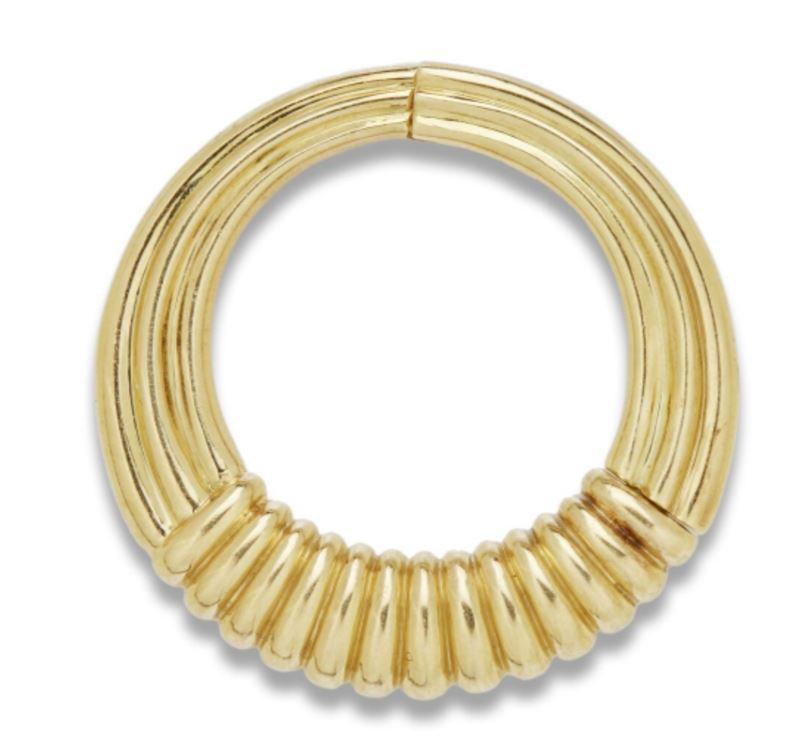
Clip Magique, 1988, yellow gold, Paris, Van Cleef & Arpels Collection.

Article on 'Van Cleef & Arpels' latest surprise: a 'Magic Circle'', Madame Figaro, 1988, Paris, Van Cleef & Arpels Archives.
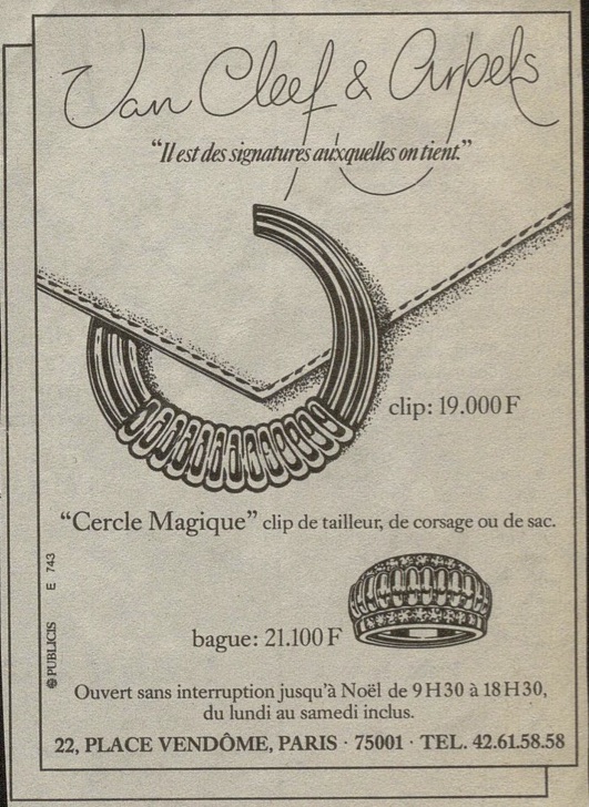
Van Cleef & Arpels advertisement illustrating the Cercle Magique clip, 1988, Van Cleef & Arpels Archives.
A phenomenon that has affected many jewellery houses since the 1970s, branded jewellery is a statement of identity and social belonging for the wearer.
[1]Also known as a logo, the apocope of a logotype. Initials, words or symbols that identify a brand.
[2]Pierre Zapalski, 'La contrefaçon: une activité en expansion', L'Aurore, 22 April 1980, n.p.
[3]'Destruction montres', TF1 13h, 14 October 1981, Paris, INA (reference: CAA8101395201).
[4]A first registration (no. 203862), dated 1933, was renewed in 1948 (no. 423560). A second monogram, used for the Sport Collection 22 watch, was registered in 1962 (no. 196259). The idea of a "VCA" monogram was developed as early as 1928 in an advertising illustration by Robert Couallier [fig. 10].
[5]François Cusset, La décennie. Le grand cauchemar des années 1980, Paris, La Découverte, 2008, pp. 329-330.
[6]Sylvie Raulet, Van Cleef & Arpels, Paris, Éditions du Regard, 1986.
[7]Chaumet catalogue, 1980, Paris, Bibliothèque Forney (call number: CC252 1980A)
[8]Anonymous article entitled 'La dernière surprise de Van Cleef & Arpels: un "Cercle Magique"' published in Madame Figaro, 1988, Paris, Van Cleef & Arpels Archives.
[9]Ibid.
***
Émilie Bérard has a Master's degree in History and Art History from the University of Grenoble-II and the University of Salamanca, and a diploma in Gemology from the Gemological Institute of America. For ten years she was Head of Heritage at the jeweller Mellerio International and has contributed to a number of publications, including the collective work Mellerio, le joaillier du Second Empire (2016).
She joined Van Cleef & Arpels in 2017 as Head of Archives and is currently Head of the Patrimony Collection.
Marion Mouchard holds a Master's degree in Art History and Archaeology from the University of Paris IV-Sorbonne. She wrote two memoirs on the jeweller Pierre Sterlé (1905-1978) and the watch and jewellery designer and manufacturer Verger (1896-1945).
A doctoral candidate in art history at the Centre André-Chastel, she is working on a thesis on archaeological jewellery in the second half of the 20th century.
The authors would like to thank the following people for their help, proofreading and confidence:
Cartier:
Violette Petit
César Imbert
Gaëlle Naegellen
Bulgari :
Gislain Aucremanne
Van Cleef & Arpels
Sibylle Gallardo-Jammes
Alexandrine Maviel-Sonet
***
Header : Bulgari, BVLGARI Roma watch, circa 1975, gold, natural hemp and leather, Rome, Bulgari Heritage Collection.
Please click on this link to subscribe to the Property of a Lady newsletter
Jewellery and the Hip-Hop culture
By Emilie Bérard and Marion Mouchard
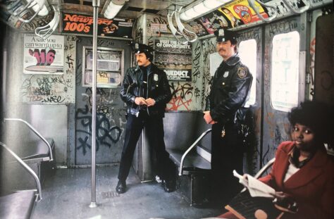
Hip-hop is a cultural movement that emerged in New York in the early 1970s1 against a backdrop of impoverishment in the poorer neighbourhoods of Harlem, Queens, the Bronx and Brooklyn. It comprises four practices: graffiti, breakdancing, deejaying and rap. One of its characteristics is the desire to belong to a socio-economic group on the one hand, and to a clan, neighbourhood or community on the other.
Above all, it promotes ostentatious individualisation, especially through appearance.
For members of rap culture, clothing and jewellery are a means of expressing status and identity: “In the 1980s, the way you dressed said more about you than anything else. [...] so it had to fit perfectly and it had to define you2”. The choice of colours, brands and even the way in which shoelaces are tied are all used to communicate the group's social status and origin3.




1 Elena Romero (dir.), Fresh Fly Fabulous. 50 years of Hip-Hop Style, New York, Rizzoli, 2023, p. 29.
2 « Around the way in the 80s, wardrobe said more about you than anything. […] it had to fit well, and it had to define you ». Ibid., p. 121.
3 Ibid., p. 115
A- Jewellery as a conspicuous sign of wealth
In rap culture, clothing and jewellery can be outward signs of success: the aim is to “dress like the person you want to be4”, and the ostentatious jewellery worn by rappers reflects their aspirations, whether financial or social. In the context of speculation and recession at the beginning of the decade, while traditional jewellers “(adapted) to the market by reducing the weight of their jewellery5” and a large part of New York's population sold their jewellery to gold dealers on 47th Street6, members of hip-hop culture distinguished themselves with exuberantly proportioned gold jewellery worn in accumulation. Wealth is measured by the chains, grillz7 and gold watches bought on Canal Street in Chinatown. In 1985, Pebblee Poo in A Fly Guy assured the audience that his earrings were made of solid gold8.
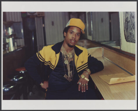
In addition to the materials, the iconography also reveals these ambitions, as do the graphic monetary symbols, especially the dollar. Similarly, branded clothing and jewellery are not just the preserve of yuppies, but also a marker of social success for members of hip-hop culture. Hip-hop culture plays a key role in accentuating this phenomenon. Through the practice of name dropping, rap lyrics reflect their authors' obsession with brands: “Name dropping showed that you belonged to a different status than all the other people [...] Fashion meant a lot. We had to dress up to be respected9”. Rap lyrics are indicators of what is fashionable. In “La Di Da Di”, the Get Fresh crew list the brands Gucci, Bally, Kangol and Ralph Lauren10. Gucci, Bally, Kangol and Ralph Lauren, along with Louis Vuitton, Versace, Armani and Tommy Hilfiger, are just some of the names of European and American luxury brands that are gradually being integrated and, above all, transformed by hip-hop style. There are also sportswear brands such as Adidas and Nike.
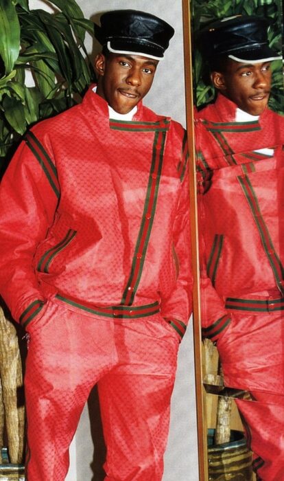
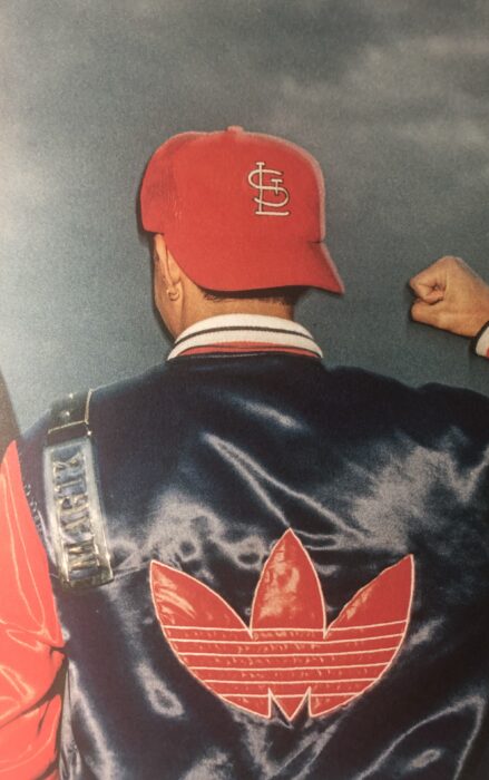
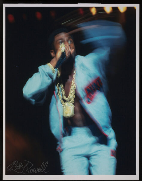
The work of Daniel Day, known as Dapper Dan, is one of the most famous examples.
He helped introduce luxury brands to hip-hop fashion - most notably Louis Vuitton, Gucci and Fendi. In his Harlem studio, which he opened in 1982, he uses logoed fabrics and leathers to create original designs11. Since then, his creations have been worn by the biggest rap stars such as Heavy D and Big Daddy Kane. Dapper Dan's success is based on his understanding of clothing as a symbol that can change the way a social group views an individual. In Harlem at the time, the key to an appearance was what inspired admiration12.
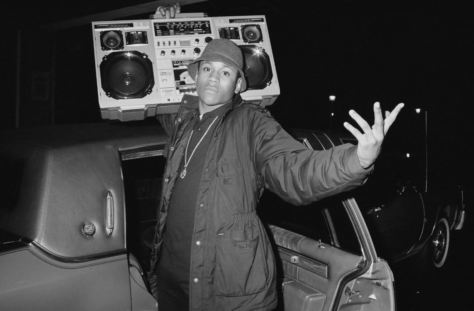

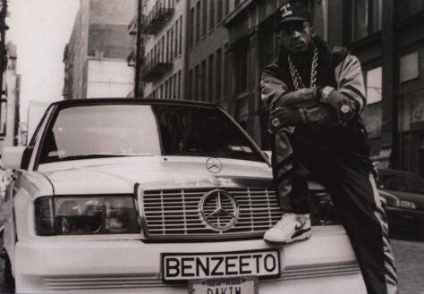
In jewellery, a recurring example is the pendant with the Mercedes-Benz car logo as its iconography. Numerous gold versions of various diameters are worn by rappers such as LL Cool J, Sir Mix-a-lot and Erick Sermon - leader of the group EPMD - to suggest their social success through the ownership of a luxury car.

AIR JORDAN 1 COMMERCIAL: Banned! (1985) (youtube.com)
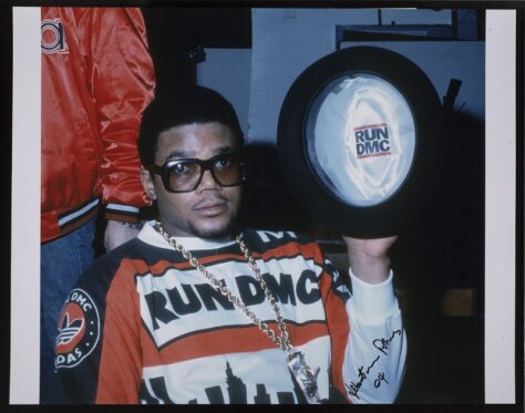
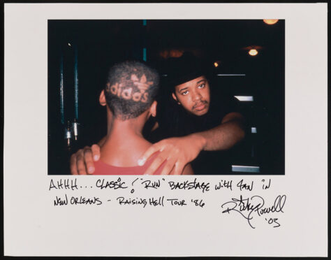
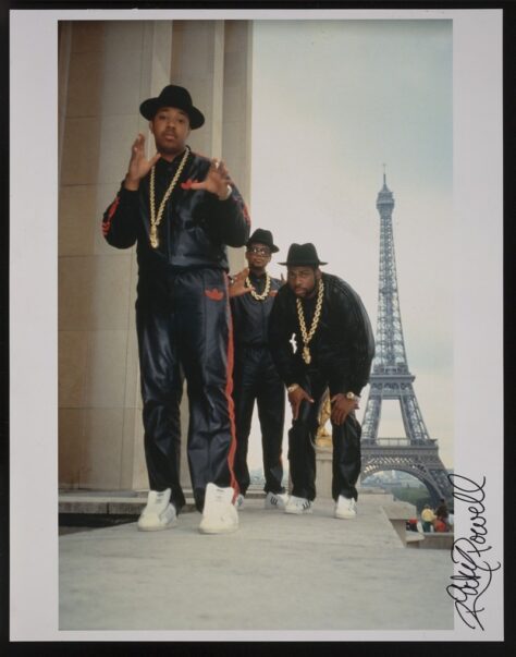
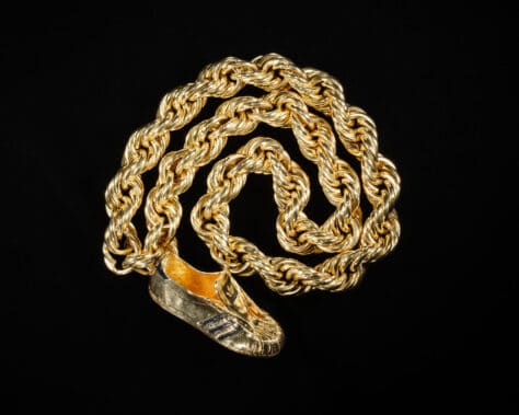
But the most eloquent example is undoubtedly the Adidas Superstar trainer pendant worn by the members of Run-DMC. In 1985, the rapper Dr Deas released a song called "Felon Sneakers", a message aimed directly at sneaker wearers and denouncing the problems associated with them13. Run-DMC responded with an ode to the Superstar trainer: “My Adidas” was released in 1986 on the album Raising Hell. This was not the band's first name drop. In 1984, in “Rock Box”, they mentioned jeans brands Calvin Klein and Lee14. The way they dressed created one of the most recognisable images of early hip-hop: often dressed in black, wearing Cazal glasses and, above all, laceless superstars with the tongue of the shoe facing outwards.
The track “My Adidas” was to make Run-DMC a success, leading to one of the first collaborations between a rap group and a brand. On 19 July 1986, they performed at Madison Square Garden and asked the forty thousand people in attendance to raise their Superstars in the air while they performed “My Adidas”15. This action and the spontaneous response it generated led Angelo Anastasio, the brand's representative, to sign a partnership agreement with Run-DMC, negotiated by their manager Lyor Cohen.
The sportswear brands then redirected their advertising strategy, banking on the multiplier effect of the controversy and the new popular figures among young people. The 1984 agreement between Nike and Michael Jordan, number 23 of the Chicago Bulls, gave rise to one of the most famous advertising campaigns of the decade. One of the fruits of the partnership between Adidas and Run-DMC is a pendant offered by the brand to the group, bearing the image of the famous coach as worn by the three rappers. This piece of jewellery symbolises the partnership, which has become a benchmark in the sector, and testifies to the cultural power of hip-hop.
4 « Dress like the person you want to become ». Ibid., p. 33.
5 « Bijhorca », TF1, 12 septembre 1979, Paris, INA (cote : CAA7901677001).
6 « L’or, incidence sur la fabrication des bijoux », Soir 3, FR3, 16 janvier 1980, Paris, INA (cote : DVC8008015501).
7 Dental prostheses, often made of gold and sometimes set with diamonds.
8 E. Romero (dir.), Fresh Fly Fabulous. 50 years of Hip-Hop Style, op. cit., p. 171.
9 « Name droppin’ happened to show that you are on a different level than someone else… […] The fashion meant something. We had to adorn ourselves. We found respect. » Ibid., p. 97.
10 Ibid.
11 Ibid., p. 33.
12 Ibid., p. 79.
13 Ibid., p. 97.
14 Ibid., p. 99.
15 Ibid., p. 97.
B- Jewellery as an outward sign of group membership
For members of hip-hop culture, appearance is also a way of asserting their membership of a group on the fringes of the dominant culture, be it a gang, a neighbourhood or a community. Each group has a highly codified language of dress in which jewellery plays an important role. At the gang level, the colours of clothing and jewellery, the symbols that adorn them, and even the hand signs, all help to identify people in an underprivileged urban environment where the way you dress can lead to violence: “The trainers you wore could either get you mugged by thieves or make you look ridiculous, so you had to think very carefully about how you dressed16”.
By the 1970s, personalised jackets, painted in gang colours or emblazoned with gang logos, had been developed17. In the case of the rivalry between the Crips and the Bloods that accompanied the development of West Coast rap in the United States, blue was associated with the former and red with the latter. Similarly, each neighbourhood had its own dress code: in Brooklyn you wore Clarks Wallabee shoes, a Kangol cap and Cazal glasses, while in Harlem you wore tracksuits and the same brand of trainers18. The same neighbourhoods have their own speciality shops, including jewellery stores: Gold Teeth USA opened in Brooklyn in 1987 and A$ap Eva in Chinatown in 1988.
Hip-hop culture in particular, “born out of the segregation and oppression of communities of colour [African-American, Latino, Jewish, Chinese] in American urban centres19”, uses jewellery as a symbol of belonging to a community. In the case of African-American rappers, wearing jewellery is part of the political legacy of the civil rights and black power movements: “They were the post-civil rights generation who wanted equality and freedom. They wanted to have a voice, by any means necessary20”.
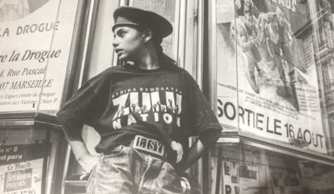
In 1989, the New York Times devoted an article to these trinkets, an affirmation of African identity: “It's a throwback to the 1960s, to the era when civil rights and the Black Power movement inspired a generation of African-Americans [...]. Once again, symbolic jewellery and clothing are worn by young African-Americans and become a statement of pride and identity21”. In the 1980s, the centre of African style and Black Power jewellery was in Harlem West22. To identify with this community meant wearing dashikis, kufis and slogan T-shirts23. In 1989, Queen Latifah and Monie Love appeared in the video for “Ladies First” wearing African turbans and Egyptian crowns24. In the same year, the Cross Colours brand was launched, promoting an African identity through fabrics and advertising campaigns25.
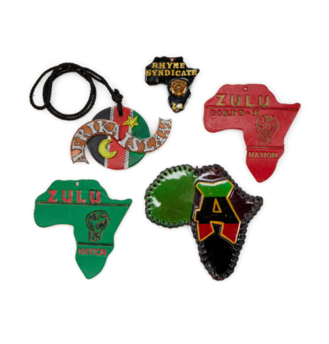

Pendants, one in the shape of an Ânkh cross, a second in the image of Elijah Muhammad, and a third with the inscription Zulu Nation, n.d., metal, leather, photograph, fabric, Washington, National Museum of African American History and Culture (object numbers: 2006.0067.11, 2006.0067.17, 2006.0067.12).
In the case of jewellery, the New York Times observed the wearing of “leather necklaces with red, black and green medallions, some forming the silhouette of the African continent, others with photographs of Malcolm X, Marcus Garvey and Haile Selassie26”. At the end of the 1980s, there was a relative “move away from gold” in rappers' jewellery. The use of leather was sometimes preferred in order to be associated with iconographic references to Africa: “Rap pioneers such as Experience Unlimited, Heavy D and the Boys, Kool Mo Dee and Public Enemy - associated with the wearing of large gold jewellery - now wear African-inspired jewellery28”. A young man interviewed by New York magazine expressed his satisfaction at this reminder of the Afro-American political past, before adding: “At least it's not these cheesy gold things anymore”.
Other pieces of jewellery, such as pendants in the shape of the Ankh cross, a bust of an Egyptian pharaoh or Queen Nefertiti, suggest a glorification of Africa's ancient past. Following in the footsteps of Malcolm X, who wore a signet ring in the colours of the Nation of Islam, the rappers of the 1980s adorned themselves to assert their identity in a society that marginalised them.
Jewellery became a symbol of pride and self-assertion.
16 « The sneakers you wore on your feet could either get you robbed or get you roasted, so you had to dress defensively. » Ibid., p. 121.
17 Ibid., p. 50.
18 Sacha Jenkins, Fresh Dressed, 2015.
19 E. Romero (dir.), Fresh Fly Fabulous. 50 years of Hip-Hop Style, op. cit., p. 11.
20 « They were the post-civil rights generation who wanted equality and liberation. They wanted to have a voice by any means necessary. » Ibid., p. 65.
21 « They are throwbacks to the 1960’s, recalling the time when the civil rights and black power movements inspired a generation of young black men and women, when everything and anything black was beautiful. [...] Once again, symbolic jewelry and clothing is being worn by young black Americans making statements of pride and identity. » Lena Williams, « In Leather Medallions and Hats, Symbol of Renewed Black Pride », The New York Times, 30 juillet 1989, p. 46.
22 E. Romero (dir.), Fresh Fly Fabulous. 50 years of Hip-Hop Style, op. cit., p. 65.
23 L. Williams, « In Leather Medallions and Hats, Symbol of Renewed Black Pride », op. cit.
24 E. Romero (dir.), Fresh Fly Fabulous. 50 years of Hip-Hop Style, op. cit., p. 33.
25 Ibid., p. 89.
26 « Leather necklaces with medallions of red, black and green, some shaped in the outline of Africa, others framing photographs of Malcom X, Marcus Garvey and Haile Selassie. » L. Williams, « In Leather Medallions and Hats, Symbol of Renewed Black Pride », op. cit.
27 « A Move Away From Gold ». Ibid.
28 « Rap grounds like Experience Unlimited, Heavy D and the Boys, Kool Mo Dee and Public Enemy – associated with the fad of large gold jewelry – now wear African-inspired jewelry. » Ibid.
C- Jewellery as a vehicle for individuality
Within hip-hop culture, the quest for social recognition also includes the individualisation of jewellery: “When luxury brands didn't serve us anymore, we created our own luxury. The most satisfying reward was to be stopped on the street and asked: “Where did you get that?” and answering “What? You don't know? I made it myself29”.
Hip-hop's modes of expression impose the presence of its inventors in a socio-political context that marginalises them through systemic poverty, displacement and targeted austerity measures. More generally, customisation and re-mixing - that is, personalisation through the addition of a singular sign or the combination of elements from different or even opposing cultural sources - are at the heart of hip-hop culture, whether in the way people dress or in the adoption of nicknames. These phenomena can be seen as early as the 1970s in the clothes worn by B-boys and B-girls, who combined the style of urban gangs with sports shoes. Graffiti offered new images that quickly moved from walls and trains to album covers and clothing. Graffiti artists - such as Shirt King Phade - work on jackets and jeans to paint unique, personal logos.
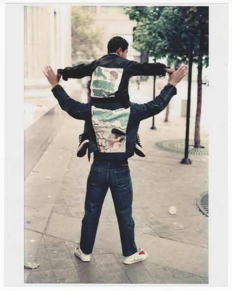
Similarly, Dapper Dan uses the logos of established European and American luxury brands but transposes them onto clothes with a loose fit derived from the urban culture of the time. In this way, Dan goes against the grain of the major labels: “I do not dictate fashion. I translate culture32”. He welcomes his customers - especially rappers, who were not welcome in the boutiques of Fifth Avenue at the time - and dresses them so that they become the best version of themselves through their clothes and their style33. By taking into account their music and personality, he created the image they wanted to project.
In short, “hip-hop's translation of individuality was expressed through customisation. To have something that no one else has, [...] to wear a unique piece of jewellery or a piece of jewellery with your name on it, is to show the world who you are34”. So the pioneers of hip-hop, who had no access to the big jewellery brands, had jewellery made that conveyed their individuality.
Namesplate jewellery is a prime example of this personalisation. They consist of a word, usually a name, inscribed in a metal plate with an openwork design and sometimes a stone. They come in a wide variety of styles: necklaces, earrings, rings, belt buckles and bracelets. There is also great freedom of choice in terms of size, typography, type of chain and ornamentation to frame the inscription, all of which can be used to create a unique piece of jewellery. In this way, nameplates were a way for early rappers to ostentatiously display their nickname, personality and individual identity.
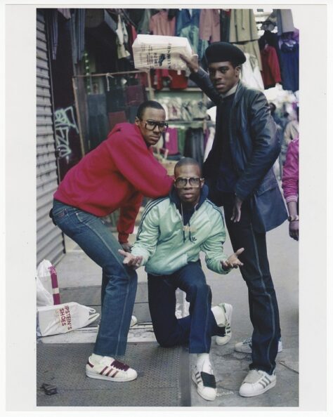


The rapper Kurtis Blow, for example, helped to shape the way rappers wore jewellery from the time of his first album: on the cover he is shown wearing an accumulation of necklaces and pendants, which at the time were of a reasonable size. On other occasions, he wears a pendant with his name on it: the letters “BLOW” are arranged vertically on a chain. The pendant thus became a distinctive piece of jewellery, imprinting the rapper's style and image on the collective imagination.
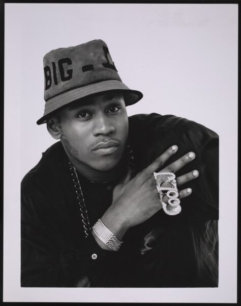

Rapper LL Cool J helped popularise the four-finger ring. He owned two rings - one with his birth name, James, with the last letter replaced by a “$”, and the second in yellow gold set with gemstones with his stage name.
In the 1990s, hip-hop culture began to gain legitimacy in the music and fashion industries. New School rappers such as Run-DMC helped to expand the influence of an alternative culture, hip-hop, on mainstream culture. The emergence of dedicated programming on free radio and television - including the important role of MTV, founded in 1981, in broadcasting video clips - helped to bring rap music and its style of dress to prime-time audiences.
The success of Dapper Dan, April Walker and Karl Kani also paved the way for the many hip-hop fashion labels that emerged in the second half of the 1980s, such as Cross Colours. Hip-hop fashion met with growing enthusiasm and saturated screens, as seen in video clips and television series such as The Fresh Prince of Bel-Air. At the same time, rappers set up their own independent labels. From then on, “artists promoting their own brand became the new norm for labels and their way of doing business. They demanded their own product placement and contracts began to reflect this35”. As rappers gained commercial and international recognition in the 1990s, it became easier for them to flaunt their success, which they could now easily afford or obtain through partnerships.
Hip-hop culture is becoming an industry in its own right, capable of working alongside haute couture and fine jewellery houses. A$AP Ferg's collaboration with Tiffany in 2018 and Jay-Z and Beyoncé's collaboration with Tiffany in 2021, confirm the changing way in which the luxury goods industry, and jewellery in particular, views hip-hop culture.
29 « When the luxury brands fall short and don’t serve us, we create our own luxury. The most satisfying payoff is when someone on the street asks that age-old question: “Where’d you get that from?”, my answer is always at the ready “What, you ain’t know!? I made it myself”. » Vikki Tobak (dir.), Ice Cold. A Hip-Hop Jewelry History, Cologne, Taschen, p. 9.
30 E. Romero (dir.), Fresh Fly Fabulous. 50 years of Hip-Hop Style, op. cit., p. 168.
31 Contraction de Breaking-Boys et Breaking-Girls, autrement dit des danseurs de breakdance.
32 « I do not dictate fashion. I translate culture. » E. Romero (dir.), Fresh Fly Fabulous. 50 years of Hip-Hop Style, op. cit., p. 79.
33 Ibid.
34 « Hip-Hop's tradition of individuality was expressed through customization. To have something nobody else has, to make you piece a bit more unique, to wear an article of adornment made with a one-of-a-kind design, to rock jewelry displaying your name, is to show the world who you are. » V. Tobak (dir.), Ice Cold. A Hip-Hop Jewelry History, Cologne, Taschen, p. 19
35 « Artists endorsing their own brands became the new norm for record labels and how they did business. They demanded their own product placement, and contracts eventually started to reflect that. » Fresh Fly Fabulous. 50 years of Hip-Hop Style, op. cit., p. 122.
***
Émilie Bérard has a Master's degree in History and Art History from the University of Grenoble-II and the University of Salamanca, and a diploma in Gemology from the Gemological Institute of America. For ten years she was Head of Heritage at the jeweller Mellerio International and has contributed to a number of publications, including the collective work Mellerio, le joaillier du Second Empire (2016).
She joined Van Cleef & Arpels in 2017 as Head of Archives and is currently Head of the Patrimony Collection.
Marion Mouchard holds a Master's degree in Art History and Archaeology from the University of Paris IV-Sorbonne. She wrote two memoirs on the jeweller Pierre Sterlé (1905-1978) and the watch and jewellery designer and manufacturer Verger (1896-1945).
A doctoral candidate in art history at the Centre André-Chastel, she is working on a thesis on archaeological jewellery in the second half of the 20th century.
***
Learn more :
Ice Cold: An Exhibition of Hip-Hop Jewelry
American Museum of Natural History
Opening Thursday, May 9, 2024
Floor 1, Mignone Halls of Gems and Minerals, Meister Gallery
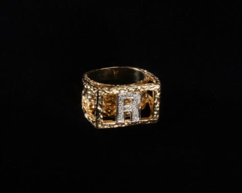
Roxanne Shanté, a member of the influential hip-hop collective Juice Crew as a teen in the 1980s, is the only female rapper to have been given a Juice Crew ring, which boasts a diamond-encrusted “R”.
Alvaro Keding/© AMNH
Ice Cold: An Exhibition of Hip-Hop Jewelry celebrates hip-hop's cultural influence through stunning jewelry worn by some of its iconic stars. Building on New York City’s celebration of the 50th anniversary of hip-hop as a global phenomenon, Ice Cold will highlight the evolution of jewelry in hip-hop over the past five decades, starting with oversized gold chains embraced by rap’s pioneers in the 1980s and moving through the 1990s, when emcees turned business moguls sported record label pendants sparkling with diamonds and platinum.

Front page image : This playful Lego pendant, designed for A$AP Rocky by Alex Moss X Pavē in 2022, is made of 14-karat gold with multicolored diamonds, sapphire, ruby, and enamel.
Please click on this link to subscribe to the Property of a Lady newsletter
Between conformity and individuality : Power jewellery
By Emilie Bérard and Marion Mouchard
From the 1970s onwards, more and more women not only entered the world of work, but above all were able to aspire to senior decision-making positions in private companies and public institutions. These new functions are accompanied by a language of appearance that defines interactions in this specific context. This language consists of asserting the competence and credibility of the person wearing it through external signs such as clothing and ornaments.
This is commonly referred to as power dressing.
Dressing according to a code allows you to actively express your identity at work: "It's kind of back to the knight and the armor. You put on your armor, and you're ready for business[1]". Clothing and jewellery have a social meaning. This "sartorial engineering[2]" is conveyed by manuals such as John Terence Molloy's famous Dress for Success book[3] and The Yuppie Handbook, which describe the silhouettes of young urban professionals. They define what is appropriate and socially acceptable in the workplace.
A stereotypical image of the businesswoman emerges, based on a balance of opposing principles: masculinity and femininity; conservatism and fashion sense; conformity and creativity[4]. The first antagonism can be illustrated by the requirement to wear a skirt suit to work. This uniform was a counterpart to the men's suit, allowing women to fit into a predominantly male environment while at the same time differentiating themselves from it. The skirt emphasises a clear separation between the sexes in a 1980s society that was returning to conservative values while redefining them at the same time.
Jewellery, like other accessories such as scarves, also contributed to the feminisation of the costume. They also crystallise the other two opposites of women's professional wardrobes.


A- Brand prestige and functionality
One of the most striking aspects of power dressing is the desire to conform to a group, in this case a professional entourage.
Dressing and behaving similarly among employees reflects shared values and goals. The success of the company is a common goal that is expressed through a generalised codification of appearance, thereby erasing individual specificity. The introduction of the suit, with trousers for men and often a skirt for women, corresponds to the standardisation of employees. Uniforms were supposed to be neutral in colour - beige, grey and navy blue were the preferred shades - with little decoration and a classic cut. It was part of a conservatism that was widespread in companies in the 1980s.
This uniformity was combined with a desire to display socio-economic status through appearance.
In the case of jewellery, John Molloy's main recommendation is to "buy […] better pieces of jewelry[5]". The biggest mistake is to wear one or more pieces of poor quality jewellery. He advises: "Instead of buying four or five pieces cheaper pieces throughout the year, [the business woman] should buy one good piece[6]". All the more so as he advocated a sensible economy in the amount of jewellery worn: "The jewelry guideline for the businesswoman is simple: the less jewelry she wears, the better of she is [7]". He was responding to the jewellery practices of the late 1960s and early 1970s: "A good guideline is not more than one ring at a time for business. A woman whose ears are pierced should wear simple gold posts. Dangling earrings are out. Anything that clangs, bangs, or jangles should be avoided[8]". In this way, he opposed the principles of accumulation and aesthetic ostentation that characterised the period between 1965 and 1975.
In short: "If [a business woman] wears any jewelry at all, it should be functional[9]".
An answer lies in an invention by Philippe and Jacques Arpels[10].
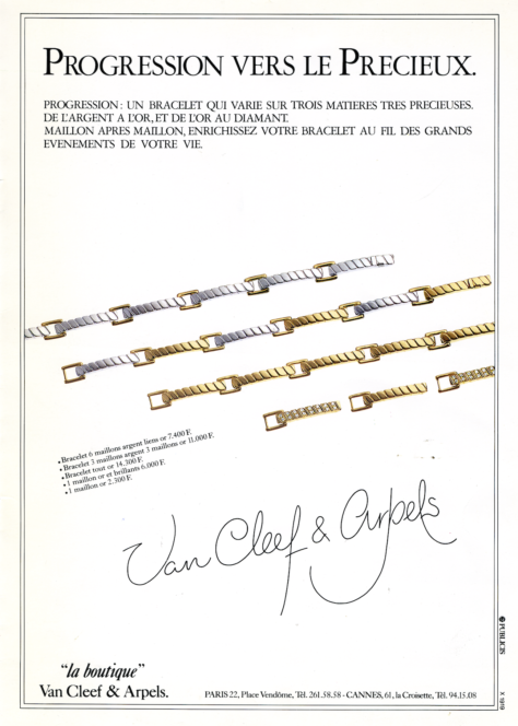

Philippe and Jacques Arpels wanted to market a six-strand bracelet in La boutique that would be "accessible to all budgets[11]" and yet bear the Van Cleef & Arpels signature, a guarantee of quality and prestige. (Born in the post-war economic context and at the beginning of the Trente Glorieuses, La boutique is the sales space opened by Van Cleef & Arpels in 1954 at 22, Place Vendôme to introduce a wide range of jewellery and objects at reasonable prices to a new clientele).
Called Progression and patented in 1983[12], this transformative piece of jewellery consists of a modular bracelet made up of a series of elongated motifs linked by square links. The motifs are hollow on the back, with two notches at one end and a pivot pin at the other, forming the link that connects each motif. This link fits into the notches of the next link and is held in place by a piston. To join two links together, simply remove the plunger, insert the link from the second link into the notches and replace the plunger. These links can be made of silver, gold or gold set with diamonds, "so that a customer who has bought the basic version can then add to her bracelet link by link, according to her means"[13]. Like the traditional pearl necklace given to a young girl on her eighteenth birthday, to which a pearl is added each year[14], "this piece of jewellery symbolises progression, the different stages of a life, the different stages of a woman's life, the different stages of a man's life[15]". Because the links could be changed "very quickly and easily[16]", the Progression bracelet was aimed at "the women of our time[17]".
Also in 1986, after a year of reflection, Jean Vendome invented the Compact[18].
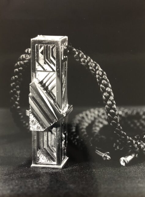
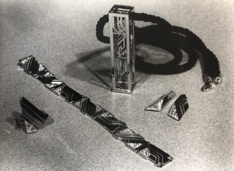
An original piece of jewellery, it takes the form of a rectangular pendant into which a ring, a pair of earrings and a bracelet are fitted. Only a few examples of this innovation were produced, but each one is unique and has its own decoration. Jean Vendome designed it for "the modern woman, a woman who works during the day but wants to be more elegant in the evening when she goes out[19]". In its pendant form, the Compact can be worn during the day. In the evening or on special occasions, the set can be unfolded and all or some of the pieces worn. In this way it meets John Molloy's functional requirements. While Molloy also recommended wearing an appropriate number of jewelled ornaments, he also indicated that they should "add presence", citing as an example "a large, expensive pendant can add presence[20]".
Among the jewellery accessories most likely to suit a working woman's life, John Molloy recommended a watch, specifically a men's model whose proportions would have been adapted to a woman's wrist[21].
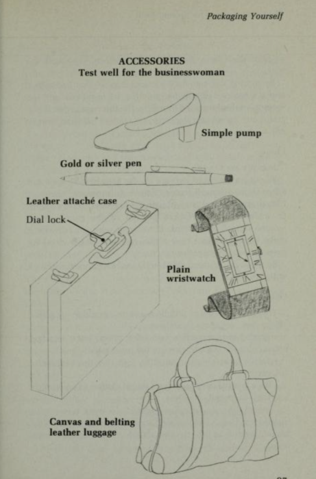
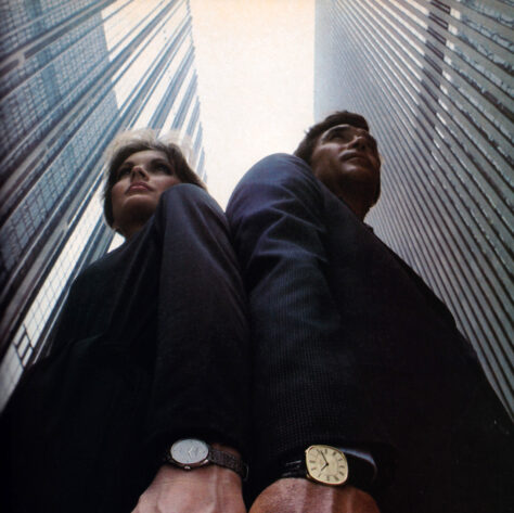

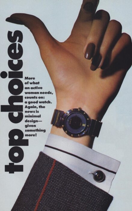
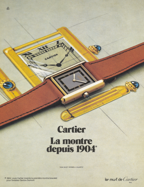
An article in Vogue echoes this recommendation: it shows a Corum men's watch on a woman's wrist. Although the hand is manicured, it contrasts with the sleeve of a shirt adorned with cufflinks and a suit jacket whose "play of stripes" is described as "masculine"[22] . By way of description, the magazine states: "More of what an active woman needs, count on: a good watch "; before continuing: "The best watch now: functional, simple... [23]". John Molloy's advice can also be found on the cover of the Yuppie Handbook, which shows a businesswoman wearing a Cartier Tank watch. The watchmaker's model, which had been constantly updated since its creation in 1917, was adapted in vermeil for the Must range in the 1970s, contributing to its wider success.
The uniformity of appearance encouraged employees to consume the same products and brands. The silhouette became a list of the big names in fashion, jewellery and leather goods, reflecting the purchasing power of this social category. The language of brands, used to excess, sometimes to the point of caricature as described by Bret Easton Ellis in his novel American Psycho, is an outward sign of belonging to a group. That's why the design of costumes and accessories must be identifiable.
The jewellery houses have understood this and have adapted their production accordingly. The production of multiple copies of jewellery or watch models that have become the personification of a brand - such as the Tank watch from Cartier - or, more obviously, that ostensibly bear the brand logo, accounts for a significant proportion of the turnover of the major houses. A version of the advertisement for the Tank watch, reproduced here, bears the slogan: "If you want to wear the watch that has been worn by people at the top since 1904, wear Cartier".
B- Interchangeable jewellery: towards personalised power dressing
This form of conformity, which is inextricably linked to power dressing, leads to a loss of individual identity when taken to an extreme. More broadly, conformity runs the risk of obscuring one's personal skills, thus hindering upward mobility within the corporate hierarchy.
Gradually, during the 1980s, women's wardrobes began to take on a more rational freedom: a wider range of colours, patterns, materials and cuts were incorporated, thanks to the combination of different garments and accessories. In certain fields, such as the media and public relations, outward signs of creative ability are even more encouraged.
One of the main vehicles for this aesthetic variety is interchangeable jewellery.
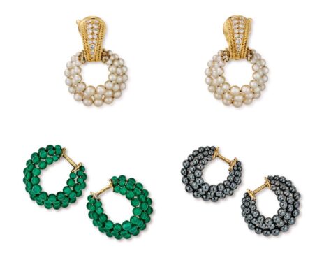
Although similar pieces of jewellery already existed in the 1930s[24] and regained popularity in the 1970s[25], they multiplied in the 1980s. Beginning with the creations of Marina B., who, since 1978 and her Pneu jewellery collection, has been constantly inventing models of earrings with removable ornaments: JP (1982), Pneus Perles and Alexia (1983)[26].

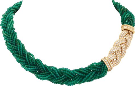
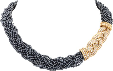
In 1984, still for La boutique, Van Cleef & Arpels created the Nattes necklace and its derivatives in bracelets and earrings, based on a yellow gold and diamond motif into which fine pearl, haematite or chrysoprase braids are inserted.
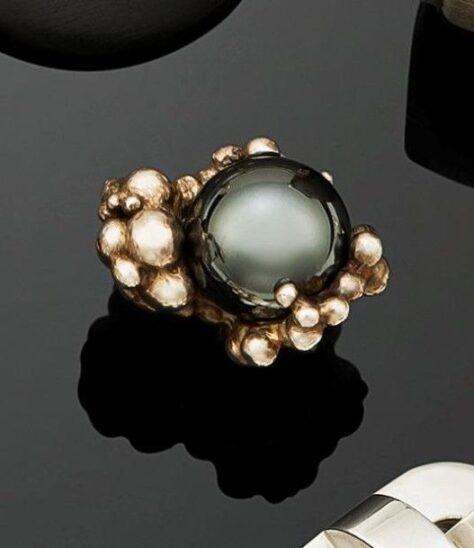
In 1988, it was Jean Vendome's turn to develop his Bulles et Boules[27] collection, with jewellery featuring a gold or silver pearl setting in which a spherically shaped gemstone is embedded. This gem, often a decorative stone, can be removed and replaced with another to vary the colours of the jewellery.
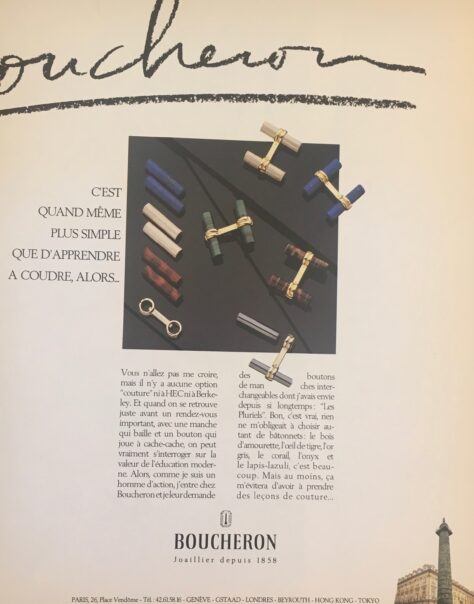
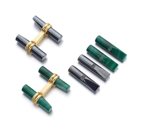
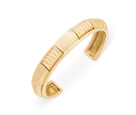
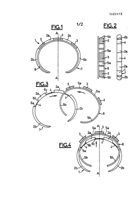
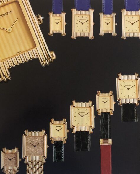
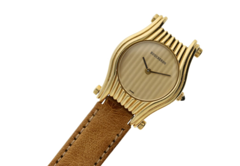
The same system is applied to Boucheron's men's jewellery, in the form of cufflinks called 'Les Pluriels': two rings connected by a yellow gold plate hold sticks of amourette wood, lapis lazuli, tiger's eye, malachite, onyx or even white gold. These can easily be removed from their settings and replaced with another material. Boucheron praised the convenience of this invention with the slogan: "It's easier than learning to sew[28]". The advertising text accompanying the illustration of these cufflinks reads: "You won't believe me, but there's no 'sewing' option at HEC or Berkeley. [...] So, because I'm a man of action of action, I went to Boucheron and asked them for interchangeable sleeve buttons[29]". Pluriels were also used in women's jewellery in the form of rings, bracelets and gold Creole ear motifs with gadroons, forming a "base" into which an "intercalary" motif in metal, coral or wood was inserted[30].

In watchmaking, the second half of the 1980s also saw a proliferation of models with interchangeable bracelets.
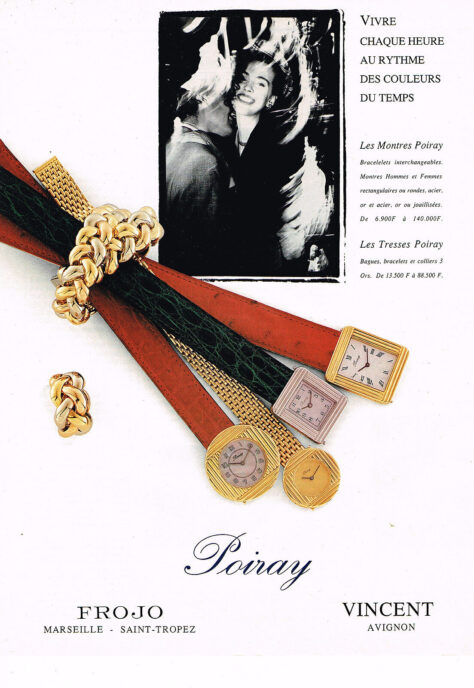
Boucheron extended its range of interchangeable jewellery with a series of watches for men and women whose dials - sometimes round, square or rectangular - were fitted with push-buttons allowing the bracelet to be easily released and replaced. Poiray's Ma Première watch, designed in 1986, was also a resounding success. Its square case was equipped with a ratchet opening system for changing the strap. As a result, bracelets were available in a wide range of colours and materials. Nathalie Hocq, Poiray's artistic director at the time, was a big fan when she presented this new watch on the set of Antenne 2[31] for "the woman of today, [the woman who] lives actively".


While the introduction of a wider range of choices creates greater freedom in the way people dress, it also creates uncertainty about what is and is not appropriate to wear in a professional context.
The meaning of clothing and jewellery becomes more ambiguous, and power dressing loses its relevance in the West at the start of the new millennium.
*** To be continued! ***
[1] Testimony reported in: Patricia A. Kimle, Mary Lynn Damhorst, "A Grounded Theory Model of the Ideal Business Image for Women", Symbolic Interaction, vol. 20, no. 1, 1997, p. 57.
[2] Ibid.
[3] The first volume of the Dress for Success manual was published in 1975 for a male audience. It was not until 1977 that The Woman's Dress for Success Book was published.
[4] P. A. Kimle, M. L. Damhorst, "A Grounded Theory Model of the Ideal Business Image for Women", op. cit. p. 51.
[5] [5] John T. Molloy, The Woman's Dress for Success Book, New York, Warner Books, pp. 89-92.
[6] Ibid.
[7] Ibid.
[8] Ibid.
[9] Ibid.
[10] Although the patent mentions Philippe Arpels as the inventor, a letter from Dominique Arpels dated 25 April 1983 attributes the idea for the Progression bracelet to his father, Jacques Arpels.
[11] [Anonymous], "Van Cleef & Arpels. Un bracelet nommé 'Progression'", Figaro Magazine, 20 May 1983, n.p.
[12] Patent no. 2 540 364 for a "detachable articulation system applicable to articles of jewellery such as bracelets, necklaces, etc.", filed on 3 February 1983, INPI archives (reference: FR2540364_B1).
[13] Letter from Dominique Arpels dated 25 April 1983, Van Cleef & Arpels Archives.
[14] "Dad's idea is a little inspired by the 'add a pearl' necklace". Letter from Dominique Arpels, 25 April 1983, Van Cleef & Arpels Archives.
[15] [Anonymous], "Van Cleef & Arpels. Un bracelet nommé 'Progression'", op. cit.
[16] Letter from Dominique Arpels, 25 April 1983, Van Cleef & Arpels Archives.
[17] [Anonymous], "Van Cleef & Arpels. Un bracelet nommé 'Progression'", op. cit.
[18] Sophie Lefèvre, Jean Vendome. Un demi-siècle de création de bijoux contemporains, cat. exposition, Lyon, Muséum d'Histoire naturelle (6 November 1999-27 February 2000), Paris, Somogy, 1999, pp. 176-177.
[19] Marlène Crégut-Ledué, Jean Vendome. Les voyages précieux d'un créateur, Paris, Éditions Faton, 2008.
[20] J.T. Molloy, The Woman's Dress for Success Book, op. cit.
[21] Ibid.
[22] "A play on menswear stripes, in a jacket, the cuff of a shirt. [Anonymous], "Top choices", Vogue, August 1984, p. 322.
[23] Ibid.
[24] Among other examples, Raymond Verger filed a patent in 1932 for a "ring with interchangeable stone" (INPI, code: FR737464).
[25] An example is Gilbert Albert's Bagatelle ring (1970), a principle also used by Chaumet in the same decade.
[26] Viviane Jutheau, Marina B. L'art de la joaillerie et son design, Milan, Skira, 2003.
[27] Sophie Lefèvre, Jean Vendome. Un demi-siècle de création de bijoux contemporains, op. cit., p. 147.
[28] Boucheron advertisement for "Les Pluriels" cufflinks, 1980s, Paris, Bibliothèque Forney.
[29] Ibid.
[30] Boucheron advertisement for "Les Pluriels" jewellery, 1980s, Paris, Bibliothèque Forney.
[31] "Plateau: Nathalie Hocq", Antenne 2, October 7th, 1987, Paris, INA (code: CAB87034614).
***
Émilie Bérard has a Master's degree in History and Art History from the University of Grenoble-II and the University of Salamanca, and a diploma in Gemology from the Gemological Institute of America. For ten years she was Head of Heritage at the jeweller Mellerio International and has contributed to a number of publications, including the collective work Mellerio, le joaillier du Second Empire (2016).
She joined Van Cleef & Arpels in 2017 as Head of Archives and is currently Head of the Patrimony Collection.
Marion Mouchard holds a Master's degree in Art History and Archaeology from the University of Paris IV-Sorbonne. She wrote two memoirs on the jeweller Pierre Sterlé (1905-1978) and the watch and jewellery designer and manufacturer Verger (1896-1945).
A doctoral candidate in art history at the Centre André-Chastel, she is working on a thesis on archaeological jewellery in the second half of the 20th century.
Please click on this link to subscribe to the Property of a Lady newsletter
The 80s are back !
Pour lire cet article en français, veuillez cliquer sur ce lien
The jewellery and jewellery-making of the 1980s has attracted growing interest from both experts and the general public, but it remains little studied. The aim of this triptych of articles, co-authored by Emilie Bérard and Marion Mouchard, is to explore the history of jewellery design in this decade, its stylistic characteristics and its codes.
The breadth of the subject and the availability of sources make it necessary to make a choice, both in terms of the designers taken as examples and the geographical centres to which they belong. Most of the references will be to so-called "traditional" jewellers and a few names of artist-jewellers, but costume jewellery and designer jewellery, for example, will not be covered. Similarly, it would be impossible to bring together here the jewellery codes of the myriad counter-cultures that animated the period, although the ornamental conventions of certain social groups were developed. It is important to emphasise the diversity of countries and cultural expressions that have yet to be brought to light in order to write a global history of the jewellery of this decade.
This series of articles will focus on the semantic importance of jewellery in social interaction in the West. The multiple meanings that condition the wearing of jewellery can be conceptualised as opposing but often porous forces.
In the 1980s, the tension between conformity and individuality was more than ever an issue, both in conservative circles and within countercultures.
***
Article I : Jewellery and the Hip-Hop culture
***
Émilie Bérard has a Master's degree in History and Art History from the University of Grenoble-II and the University of Salamanca, and a diploma in Gemology from the Gemological Institute of America. For ten years she was Head of Heritage at the jeweller Mellerio International and has contributed to a number of publications, including the collective work Mellerio, le joaillier du Second Empire (2016).
She joined Van Cleef & Arpels in 2017 as Head of Archives and is currently Head of the Patrimony Collection.
Marion Mouchard holds a Master's degree in Art History and Archaeology from the University of Paris IV-Sorbonne. She wrote two memoirs on the jeweller Pierre Sterlé (1905-1978) and the watch and jewellery designer and manufacturer Verger (1896-1945).
A doctoral candidate in art history at the Centre André-Chastel, she is working on a thesis on archaeological jewellery in the second half of the 20th century.
***
Andy Warhol's portrait of HRH Princess Caroline of Monaco wearing Van Cleef & Arpels earrings for the cover of Vogue, December 1983-January 1984.
Please click on this link to subscribe to the Property of a Lady newsletter


